
Filed under: Uncategorized | Tags: art, art process, contemporary art, drawing, inkonpaper, sketchbook
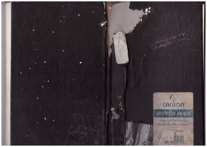 My brother Scott visited from Long Beach, California, and he brought me this water-damaged sketchbook from more than 20 years ago. I thought my old drawings might be kind of embarrassing. Scott’s an artist, he’s smart, and he thinks a lot. He suggested that it would be less important to me how the drawings looked, and more important remembering where I was when I drew the sketches. He’s often full of wisdom like that.
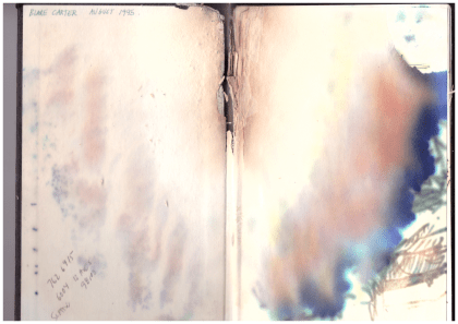
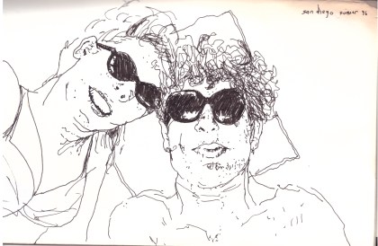
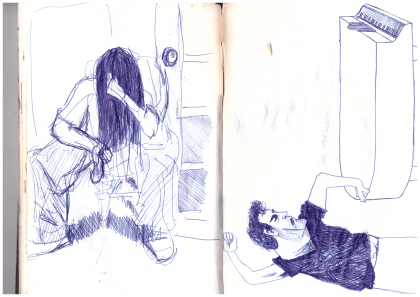
Scott was right. The drawings were better than I’d thought they would be, but the trip down memory lane was even better. I finished college in 1994, and this sketchbook is from the year after. I’d just moved into my first apartment ever in Georgetown, south Seattle, and had a painting studio down the street that I shared with Scott. The place I lived in wasn’t so nice. I came home once to find a neighbor passed out on the stairs with a 2×4 in one hand and a case of Schmidt Ice in the other. A visiting girlfriend discovered that someone pooped in the communal shower. There was screaming and ambulances, and there was a mouse that lived in my stove. The opening page of the sketchbook reads “August 1995,” and towards the end of the book there’s a drawing dated November 1996.
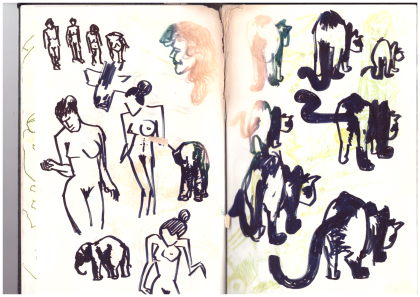
The drawings aren’t bad like I’d feared. This one on the right, like a lot of them, was based on art I saw in a magazine or book. I think the cats are from a Japanese ink painting I saw somewhere. The figures on the left remind me that I was reading Norman Mailer’s “Portrait of Picasso as a Young Man,” published that year.
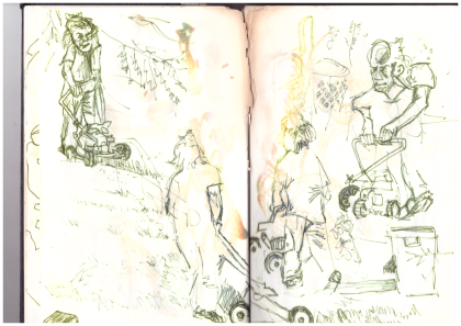
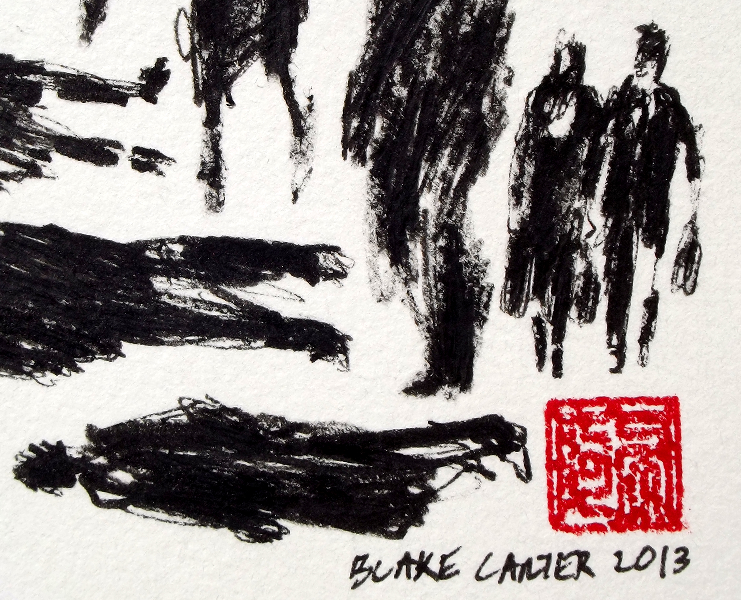
I drew these in the yard of my parent’s house in Gig Harbor, Washington. That’s Scott mowing the lawn. I was interested in blind line-drawings at the time, kind of makes everything look a bit cubist.
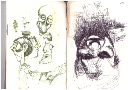
I was totally fascinated with Francis Bacon, still am. He’d just died a few years before. Interesting how differently the inks on the left and right pages held up. These days I try to only use art materials that promise to be “archival quality.”
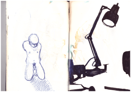
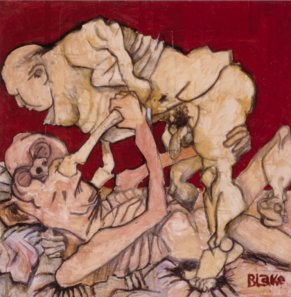
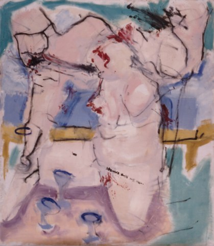
The studies above became part of my first oil painting. I’d painted with oils before, but just student work and none of it was very good. This one turned out well, I think. Friends teased me about the subject matter. I wanted something that would catch attention.
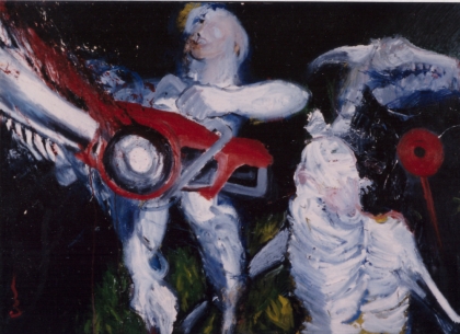
The drawing to the right, above, also became part of a painting. I drew people as structures, like buildings or machines. Line quality and shapes meant more than the figures I was piecing together. You can tell I was looking at Picasso. The painting is acrylic on a failed oil painting. It’s now rolled up under my bed, falling to pieces.
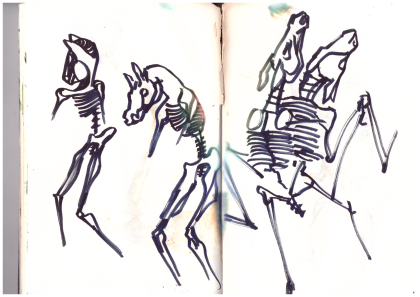
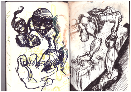
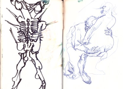
Always fascinated by skeletons. Not sure where I was going with the horse sex thing, but there are a few in this sketchbook. The horse skull later made an appearance in my favorite oil painting from this time. I still have my paintings from this period, but they’re in bad disrepair because I painted on top of old paintings. Someone told me it didn’t matter, I just had to keep painting. It sounded good because I didn’t have money for new canvas every time I didn’t like a painting, but it was a mistake.
More horse sex, and a copy of Otto Dix from a book.
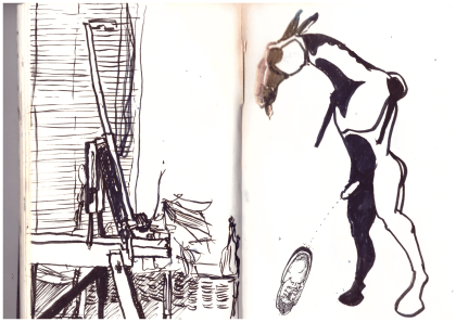
I think I thought there was something sexy about horse legs. For the record, I’ve never purposely peed on a shoe.
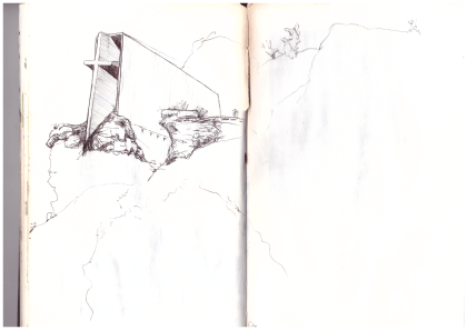
Saw this chapel on a family vacation, maybe in Utah.
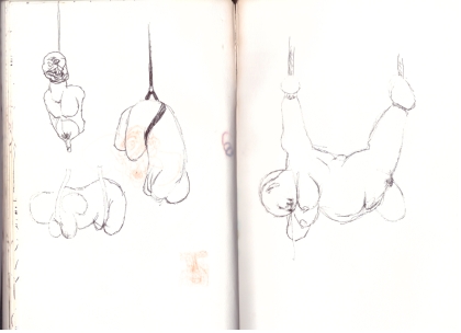
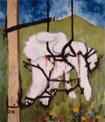
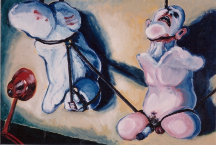
I got interested in things hanging by leather straps. Not really personally interested, but I thought it looked good. The above sketch turned into my largest painting to date. The painting contains a literary joke: “The grass is always greener” on the left side of the post.
I got pretty excited about jokes in paintings at the time. Friends had been teasing me about how I always had penises in my paintings, so in this one I didn’t paint the penis, but instead there’s text that reads “The … mightier than the sword,” leaving out the words “pen is” right where the missing penis would be. Brilliant! No one ever thinks it’s as funny as I do.
Here’s one of my best memories to date, toward the end of the sketchbook. Me and my girlfriend at the time went camping together on the Baja Peninsula. We’d realized we weren’t perfect for each other, but decided to have a last hoo-rah trip anyway. I saw her once again after that, in Southeast Asia. It’s been almost twenty years since we said goodbye in Hoi An, Vietnam.
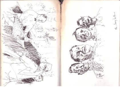
I’m not sure whether this one on the left is based on a picture or something I just did freehand. Either way, I definitely had more patience than I do now. On the right the Clancy Brothers, from a photograph.
It’s weird looking at these drawings from so long ago. They’re mine, but for the most part, I don’t remember drawing them. It reminds me that I can be a different person in different contexts. I recently heard an NPR podcast about the fallacy that people are born and live with a certain personality. You’d assume that it was a thread you could follow through someone’s life, but really, people adapt to the situations they experience.
This old sketchbook is from 1995, when I was 23 years old. I turned 45 this October. My “art career” hasn’t really taken off (yet). I kind of put art in the back of my mind in my late 20s, and though I never stopped sketching and thinking about art, there was a gap of ten or so years when I didn’t push myself to make finished pieces I was proud of. I thought I’d never be able to make money from art, so I concentrated on other things. I came back to it about ten years ago. While working for a newspaper in Taiwan and interviewing artists for articles about their shows, I realized that I liked making art better than anything I’d done to pay bills or have health insurance or all that. So now I have a day job delivering beer that gives me three-day weekends, but really I’m an artist, and I’m happier with my artwork than I’ve ever been.
Filed under: 2013.APRIL | Tags: art, california, contemporary art, etching, how to etch, modern art

My first proof of 61 Pedestrians (Etching).
I love to try new things, and it’s tempting for me to abandon everything I’ve learned each time I begin a project. Experience has shown, however, that starting anew isn’t always the best way forward. My art progresses the most when I select what I like about a piece or a series, keep that constant, and limit my variables.
With that in mind, I decided that my first foray into zinc-plate etching should expand on something I’m already very familiar with — my Pedestrian Series (examples on my website).
As the images in the series are line-based, I chose to work with a hard ground. That means I coated my zinc plate with a thin, brown layer of waxy “ground,” let it dry, and then carved my image into the ground with a stylus called a Whistler’s needle. The lines that I scratched into the wax exposed the shiny zinc plate below. I then set the plate in an acid bath so that the exposed lines were etched into the plate, while the waxy ground protected the rest of the plate.
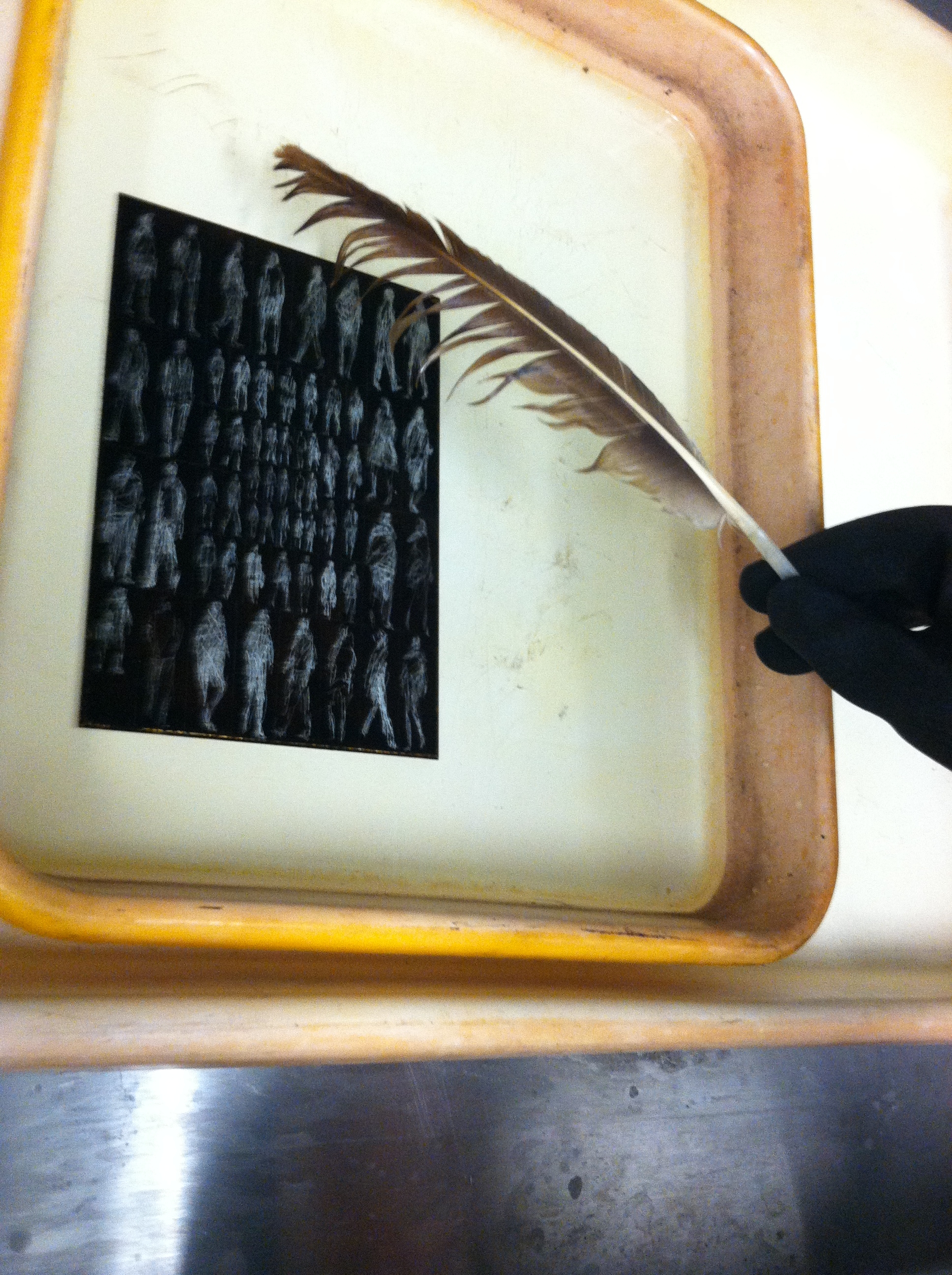
The delicate de-bubbling process.
In the above picture you see my plate in the acid bath. The light figures are the places where I carved away the waxy ground with my Whistler’s needle, and the dark background is the ground. The reaction of the acid and the exposed zinc plate creates small bubbles that need to be brushed off with a feather, or else they’ll leave a small bubble pattern that will distort the lines.
After etching the plate in the acid batch and cleaning off the ground with mineral spirits, I had a clean zinc plate with tiny grooves etched into it. This was covered in ink and then carefully wiped off, leaving ink in the grooves, but not on the surface of the plate. I then set a piece of paper on the plate and ran it through a very tight press, pushing the fibers of the paper into the inked grooves, and wa-lah! — the image you see at the top of this post.

That’s the spirits.
It all sounds simple enough, but it does take time, especially while you’re inking and wiping the plate prior to printing. You can only run the plate through the press once, for a single print, and then you need to ink and wipe again, which takes at least ten minutes. Whenever you finish printing, the plate can be cleaned with mineral spirits and stored until you’re ready to ink-wipe-print again.
I have two more days in the printmaking studio at Golden West College here in Huntington Beach, and I plan to use them experimenting with different inking/wiping techniques. For my first proof I left a lot of “plate tone” to give it a must old-fashioned look, and I want to see what a print will look like if I wipe a little more for a cleaner image.
If any of you have etching experience, let me know if you have any suggestions. If you don’t, I wonder if my description of the process made sense to you — it’s all pretty easy if you’re doing it. Feel like you know how it works?
Filed under: 2013.FEBRUARY, SCRAPS | Tags: art, asian art, California art, Chinese calligraphy, contemporary art, ink painting, Orange County art
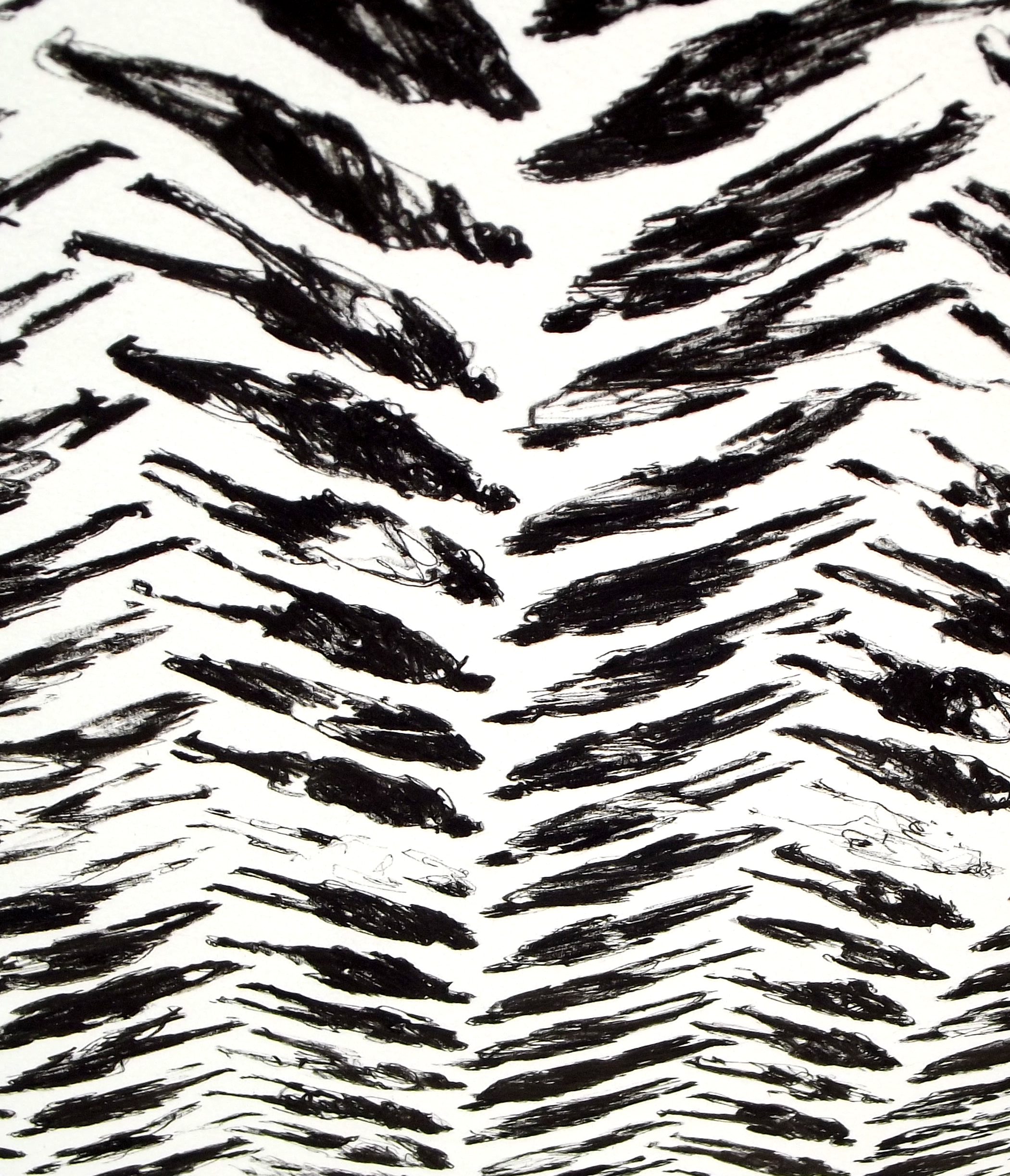
163 Pedestrians (Tread) – DETAIL 1
30×22 inches
Ink on paper
I’ve been working on my Pedestrian Series since I moved from Taiwan to California in late 2011. So far all the pieces are ink on paper. I like scribbling out rough-looking figures and arranging them in neat grids, something like the looser styles of Chinese calligraphy. In my earlier works from the series, I lined the figures up in a very straightforward manner. Every figure in a piece took up the same amount of space, and they were placed in simple columns and rows.
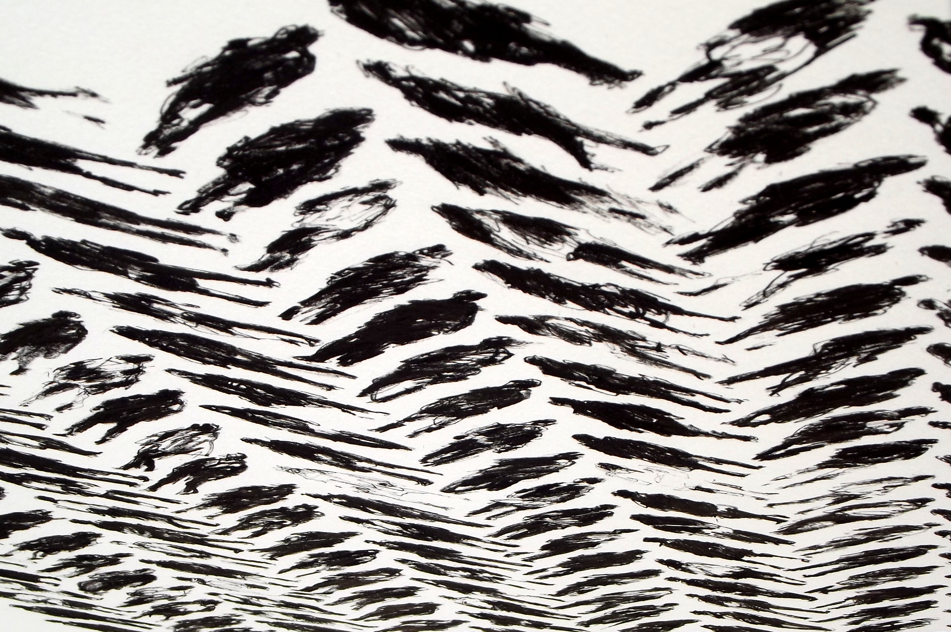
Above and below are details from my latest piece in the series, 163 Pedestrians (Tread). The full piece can be viewed here. Recently I’ve been toying with patterns, and I came up with the layout of Tread while thinking about basic weave patterns. I like the way the picture plane looks three-dimensional from different angles.

163 Pedestrians (Tread) – DETAIL 2
163 Pedestrians (Tread) – DETAIL 3
163 Pedestrians (Tread) – DETAIL 4
Once I get a few more images of my newer work ready, I’ll compare the different patterns I’ve been experimenting with.
Filed under: 2012.NOVEMBER, SCRAPS | Tags: art, California art, calligraphy, chinese art, contemporary art, ink, women
 (Detail 1)")
Killer bees attack (column 12, row 2).
Above and below are details from 255 Pedestrians (and Stroller), completed late last night. As in most of my recent works, I’m playing around with ways to make marks using Sakura Pigma Graphic and Sakura Pigma Micron pens. I’ve also been trying to push myself to draw more women. For some reason Freudian or otherwise, I tend to enmasculate females when I’m drawing. I figure it’s something to do with mirrors. Regardless, I don’t often hear complaints that there are too many women around.
 (Detail 2)")
Shrunken-head Pablo (column 11, row 11).
 (Detail 3)")
Stretch pants (column 5, row 14).
 (Detail 4)")
This is one of my favorites from this piece. No pedestrian really, just scribbly swirls.
 (Detail 5)")
Some of these lines cut into the paper, so up close this almost looks like bas relief (column 6, row 8).
 (Detail 6)")
I wanted suggestion to play a big part in this drawing. Does this woman have feet? (column 1, row 2)
Eventually I’ll get an image of the final piece up on my gallery of finished works, for now it’s on my Facebook page.
Filed under: 2012.NOVEMBER, SCRAPS | Tags: art, art technique, calligraphy, China, chinese art, Chinese calligraphy, contemporary art, drawing, ink, modern art, scroll painting
")
In my previous post I noted how differently pieces from my Pedestrian Series look in real life and in photographs. Here are more close-ups, this time from 255 Pedestrians, a piece I finished yesterday. Watch the figure above as you scroll down. Starting with her, I zoom out to show the surrounding eight figures, then the sixteen figures surrounding those, and etc, up to the finished work.
")
")
")
")

Filed under: 2012.NOVEMBER, SCRAPS | Tags: art, art technique, California art, calligraphy, China, chinese art, contemporary art, ink, scroll painting
 (Detail)")
The above detail is about 2.5 inches across. One thing my ongoing show in Laguna has taught me is that my current works look much, much better in real life than they do in photographs or on a monitor. The most basic problem is that the plane of our eyes’ focus changes constantly, and this is impossible to achieve with a camera. Even line art on the slickest vellum looks much better to the eye than it ever could in print. In a previous post I noted how happy I was that a friend and collector chose to hang my work at the end of the entrance hallway of his house; the pride of place was flattering, but I also know that people entering his door will see my piece from a distance first, and then their focus will change as they approach the wall on which it’s hung.
Below are five works I’ve completed since sending pieces for my current show to the framer. I’ve been experimenting around with my Pedestrian Series:

Now here’s what I love most about this series. Each figure is composed of rough, abstract lines and forms that together add up to the images you see from a distance. In a photograph, these forms are only visible in a close-up view:
")
In these details, you can see how the ink is sometimes jammed down into the porous watercolor paper, while at other times the pen has been roughly slid along the surface, and still others, the ink sits atop the paper in a layer:
 (Detail)")
I’ve been playing around with introducing color into these works. Below is a detail of a piece that includes marks using Prismacolor Premier markers, but I’m not sure if I like the way the ink soaks into the paper so easily. You can tell the difference between the thick orange lines (Prismacolor) and the fine red lines (my usual Sakura pens) flaring out from the figures:
 (Detail)")
Here’s another experiment. For this piece I coated the paper with a layer of black acrylic paint, and then scraped the white forms out with an X-acto blade:
 (Detail)")
Another view of the same piece, showing how the individual images look up close and further away. Only with the naked eye can you see both views of the same image at the same time.
 (Detail II)")
Filed under: 2012.OCTOBER, SHOWTIME | Tags: art, art show, california galleries, contemporary art, hanging art, Laguna Beach


My show at Laguna Inkspot Gallery comprises nineteen pieces in ten different sizes. The distance between the floor and the center of each piece is 57 inches, so the top of a 30 inch piece is 72 inches above the floor (57 + (30/2)), easy right? But then the wires attaching each of the works are at different heights, even for two works of the same size (one wire might hold a work at 7.25 inches from the top of the frame, another at 7.5 inches from the top). Height of nail equals 1/2 height of artwork minus distance from top of frame to wire plus 57 inches. Then they need to be centered on the wall. When this show’s all finished and done I’ll post a list of what I would do if I were starting over, no big mistakes but could have made things easier for myself.
