
Filed under: Uncategorized | Tags: art, art process, contemporary art, drawing, inkonpaper, sketchbook
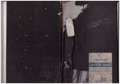 My brother Scott visited from Long Beach, California, and he brought me this water-damaged sketchbook from more than 20 years ago. I thought my old drawings might be kind of embarrassing. Scott’s an artist, he’s smart, and he thinks a lot. He suggested that it would be less important to me how the drawings looked, and more important remembering where I was when I drew the sketches. He’s often full of wisdom like that.
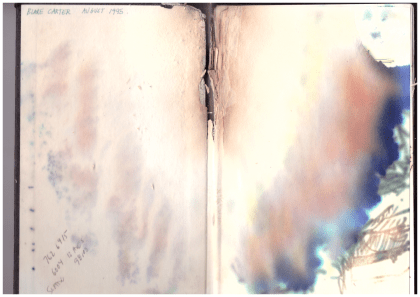
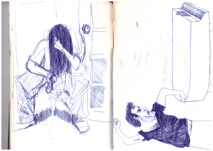
Scott was right. The drawings were better than I’d thought they would be, but the trip down memory lane was even better. I finished college in 1994, and this sketchbook is from the year after. I’d just moved into my first apartment ever in Georgetown, south Seattle, and had a painting studio down the street that I shared with Scott. The place I lived in wasn’t so nice. I came home once to find a neighbor passed out on the stairs with a 2×4 in one hand and a case of Schmidt Ice in the other. A visiting girlfriend discovered that someone pooped in the communal shower. There was screaming and ambulances, and there was a mouse that lived in my stove. The opening page of the sketchbook reads “August 1995,” and towards the end of the book there’s a drawing dated November 1996.
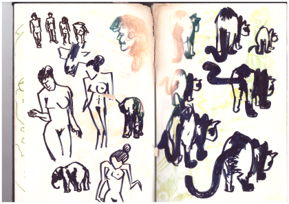
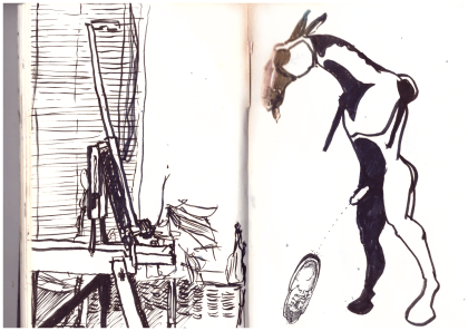
The drawings aren’t bad like I’d feared. This one on the right, like a lot of them, was based on art I saw in a magazine or book. I think the cats are from a Japanese ink painting I saw somewhere. The figures on the left remind me that I was reading Norman Mailer’s “Portrait of Picasso as a Young Man,” published that year.
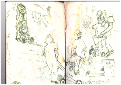
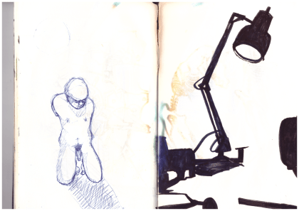
I drew these in the yard of my parent’s house in Gig Harbor, Washington. That’s Scott mowing the lawn. I was interested in blind line-drawings at the time, kind of makes everything look a bit cubist.
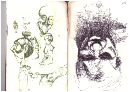
I was totally fascinated with Francis Bacon, still am. He’d just died a few years before. Interesting how differently the inks on the left and right pages held up. These days I try to only use art materials that promise to be “archival quality.”
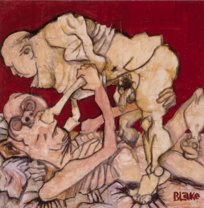
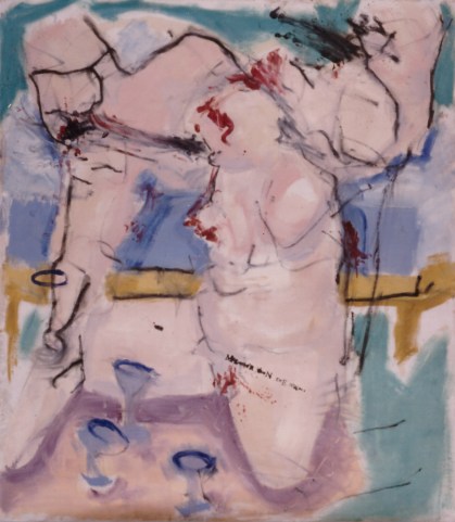
The studies above became part of my first oil painting. I’d painted with oils before, but just student work and none of it was very good. This one turned out well, I think. Friends teased me about the subject matter. I wanted something that would catch attention.
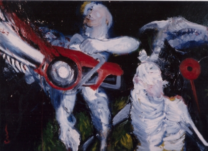
The drawing to the right, above, also became part of a painting. I drew people as structures, like buildings or machines. Line quality and shapes meant more than the figures I was piecing together. You can tell I was looking at Picasso. The painting is acrylic on a failed oil painting. It’s now rolled up under my bed, falling to pieces.
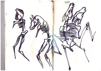
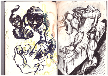
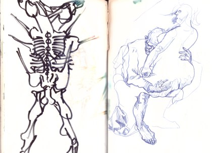
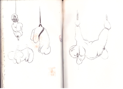
Always fascinated by skeletons. Not sure where I was going with the horse sex thing, but there are a few in this sketchbook. The horse skull later made an appearance in my favorite oil painting from this time. I still have my paintings from this period, but they’re in bad disrepair because I painted on top of old paintings. Someone told me it didn’t matter, I just had to keep painting. It sounded good because I didn’t have money for new canvas every time I didn’t like a painting, but it was a mistake.
More horse sex, and a copy of Otto Dix from a book.
I think I thought there was something sexy about horse legs. For the record, I’ve never purposely peed on a shoe.
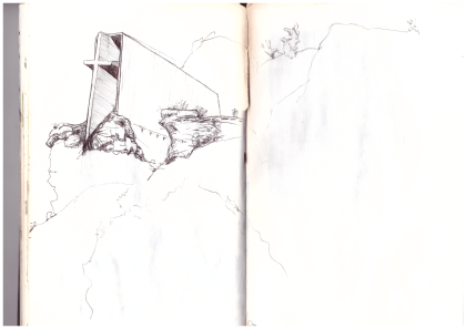
Saw this chapel on a family vacation, maybe in Utah.
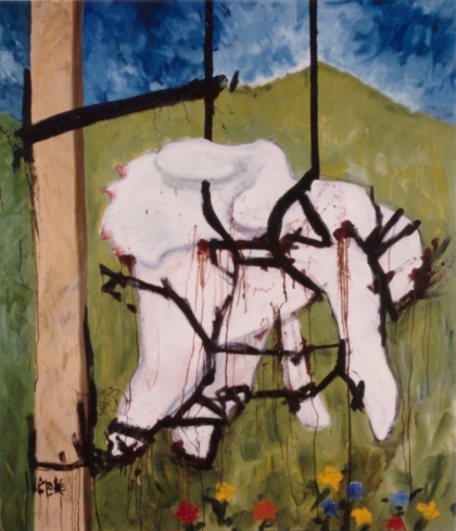
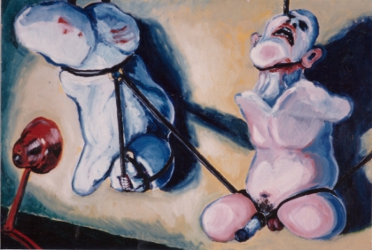
I got interested in things hanging by leather straps. Not really personally interested, but I thought it looked good. The above sketch turned into my largest painting to date. The painting contains a literary joke: “The grass is always greener” on the left side of the post.
I got pretty excited about jokes in paintings at the time. Friends had been teasing me about how I always had penises in my paintings, so in this one I didn’t paint the penis, but instead there’s text that reads “The … mightier than the sword,” leaving out the words “pen is” right where the missing penis would be. Brilliant! No one ever thinks it’s as funny as I do.
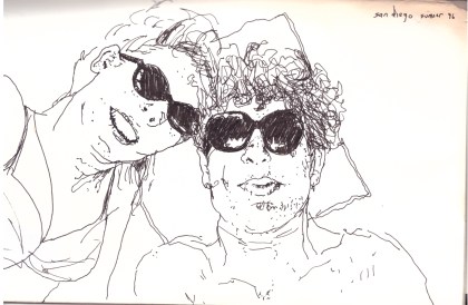
Here’s one of my best memories to date, toward the end of the sketchbook. Me and my girlfriend at the time went camping together on the Baja Peninsula. We’d realized we weren’t perfect for each other, but decided to have a last hoo-rah trip anyway. I saw her once again after that, in Southeast Asia. It’s been almost twenty years since we said goodbye in Hoi An, Vietnam.
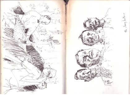
I’m not sure whether this one on the left is based on a picture or something I just did freehand. Either way, I definitely had more patience than I do now. On the right the Clancy Brothers, from a photograph.
It’s weird looking at these drawings from so long ago. They’re mine, but for the most part, I don’t remember drawing them. It reminds me that I can be a different person in different contexts. I recently heard an NPR podcast about the fallacy that people are born and live with a certain personality. You’d assume that it was a thread you could follow through someone’s life, but really, people adapt to the situations they experience.
This old sketchbook is from 1995, when I was 23 years old. I turned 45 this October. My “art career” hasn’t really taken off (yet). I kind of put art in the back of my mind in my late 20s, and though I never stopped sketching and thinking about art, there was a gap of ten or so years when I didn’t push myself to make finished pieces I was proud of. I thought I’d never be able to make money from art, so I concentrated on other things. I came back to it about ten years ago. While working for a newspaper in Taiwan and interviewing artists for articles about their shows, I realized that I liked making art better than anything I’d done to pay bills or have health insurance or all that. So now I have a day job delivering beer that gives me three-day weekends, but really I’m an artist, and I’m happier with my artwork than I’ve ever been.
One of my favorite parts of ArtForum Magazine is the “Passages” section, which highlights artists who have recently died. Instead of the typical lifeless obituary, “Passages” includes current interviews and essays with and by living artists, friends and critics, often written rather casually.
For me, the subjects of “Passages” have two things going for them that make them stand out from most of the other artists featured in the magazine: (1) They’ve just died, so they probably produced their best-known work during my lifetime; and (2) They’re famous enough to have been selected for the column, meaning I’m probably familiar with their work.
A few weeks ago I opened the September issue of ArtForum and learned that Chris Burden had passed away in May. The magazine featured excellent, touching essays by several artists, including Vito Acconci. Burden was 69 and died of cancer, if that matters. His death doesn’t change what I’m going to try to do here: Explain why I’ve always felt an affinity with Burden, who I didn’t know, never met, and can’t even say I’m terribly familiar with.
I first learned of Burden while at Whitman College through Dennis Crockett, who was such a good art history professor that it doesn’t seem right to describe him as just “an art history professor.” When Dennis spoke in class, I felt like he was talking to me only. When he described trends in the art world, it seemed like he was re-writing my childhood so that anything I did afterwards was informed by all that came before. My floating head grew a neck, shoulders, arms, torso and legs, and then my feet reached the ground. Sounds rich, but that’s how I felt.
At the time I was probably nineteen or twenty years old, and I still thought that art was about colors and perspective and prettiness.
Chris Burden’s most famous work, and the first one I remember learning of, is called “Shoot.” In front of a small audience, he walked to one end of a gallery and held out his left arm. Another man stood sixteen feet away, raised a .22 rifle, and shot him in the arm. End of performance. Burden went to a hospital.
For another piece, Burden lay back atop a Volkswagen Beetle and an assistant nailed his hands to the roof of the car. The car was rolled out of a garage with Burden “crucified” on top, revved up for two minutes, and rolled back in the garage.
So that’s art, I wondered, and so is the Impressionist boat painting in the dentist’s office? I never questioned whether Burden was creating “art.” I just tried to reconcile his work with my own narrow experience of drawing, painting and sculpture. Maybe the idea that art meant bringing something new into the world could be applied to concepts, and there wasn’t any need for material proof that they ever even happened. But where do you go from there? I still don’t know.
That’s kind of a lie. The “Where Do We Go?” question is addressed in anything that anyone makes after they know of artists like Chris Burden. Art wasn’t just torn up and thrown out the window, it was just more informed.
There’s a kind of an answer in Burden’s later work. The performances I described above took place in the 1970s, about twenty years before I “discovered” them in college. Much of his later work explored scale and juxtaposition. Here are a few pieces I know of, in order of whatever I think of, and as inaccurate as I remember them:
- Burden raised money and placed silly TV ads. Some of them are painfully awkward, but Burden doesn’t care! Then there’s one that’s absolutely brilliant. I think I heard about it from Dennis Crockett two decades before I actually saw it on YouTube. It’s just text with a narrator reading out names: “Leonardo da Vinci … Michelangelo … Rembrandt … Vincent Van Gogh … Pablo Picasso … Chris Burden.” It was played as an ad during Saturday Night Live. Ha! Brilliant! (See Burden’s video ads here.)
- He built a giant Erector Set building, like as large as a real building.
- He made a piece called “You’ll Never See My Face in Kansas City,” where he just sat in Kansas City for a while, wearing a balaclava. No one could see his face! The man was a genius. Now think back to when he got shot in the arm: Title of that piece? “Shoot.” Effin’ hilarious!
- He built a giant vertical wheel, huge, out of concrete, so big that they had to cut out part of the gallery’s ceiling or floor for it to fit in. Then he backed a motorcycle up to it, and started it spinning, so when you see it you know it could totally wreck the gallery and kill everyone if it slipped off its axle.
- He made a giant slot car track that’s at the Los Angeles County Museum. I thought this one sounded dumb, but had a bit of an art experience when I saw it for real. I like art that makes you ask “Why?” Nobody asks why someone paints a pretty picture, but why did Burden take toys so seriously, or did he take them seriously? There’s a lot of Sisyphus, but it seems so brash and boastful that it’s like he enjoys the uphill part. Enjoy the uphill part: That’s a Burden lesson.
Another important thing about Burden is that he didn’t look like he was out to educate people. He just po-facedly said and did what he was going to do. You’ll cringe if you watch the videos I linked to above. He was a normal, kind of creepy-looking dude. There’s no sense of glamour, though to me he aimed high and challenged us to rise up to his smart, serious, humorous take on what art is, and what is important about new things.
I hope I absorbed some of what Chris Burden had to say, and I wish more people would pay more attention to new ideas in the art world. I mean just all of us. There’s something there that’s bigger than the world as we know it. I was lucky to have such an enthusiastic introduction in college. Everyone knows what happened art-wise in early 20th century France, maybe even what happened in New York half-way through the 20th century. After that it gets jumbled because it’s relatively recent, but it’s just as important to our collective thought. I know Chris Burden isn’t “new” – Hell he’s dead since May and didn’t die young – but I changed because of his work.
That’s the best thing I can say about an artist: I think differently because of Chris Burden. I suspect everyone does, even when we don’t know it.
Filed under: GICKERS | Tags: abstract expressionism, Blake Carter, clyfford still, colorado art, contemporary art, denver art, denver museums, still museum
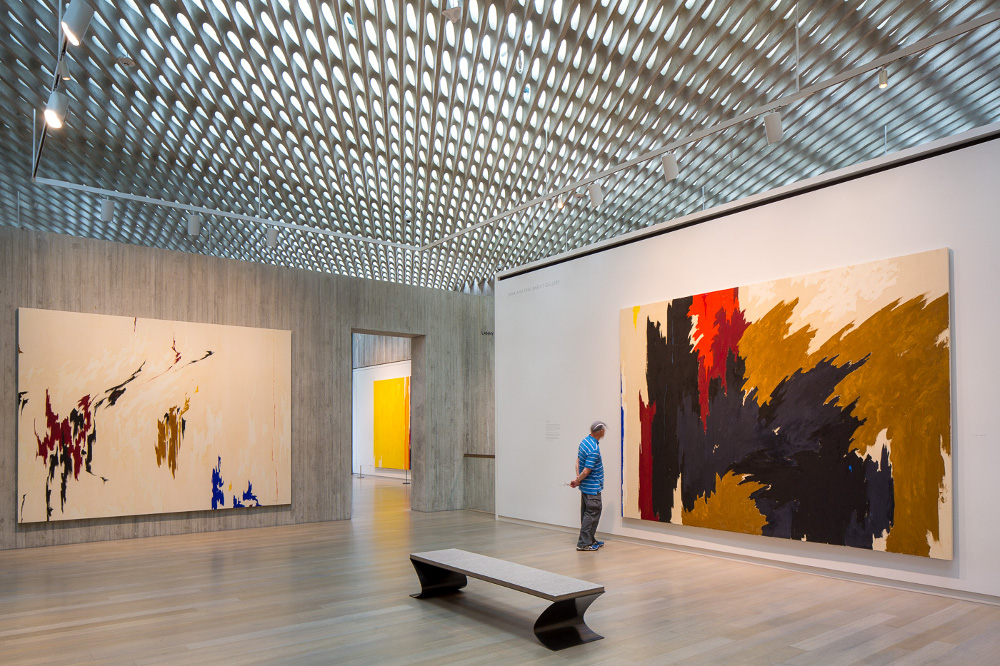
The final gallery in the Clyfford Still Museum, Denver. Photo by James Florio, courtesy of the museum.
It’s rare to see a significant portion of an important artist’s oeuvre in a single exhibition, or even in a single museum. By the time artists become established, most of their work is dispersed in museums and private collections, making it extremely difficult to organize a thorough retrospective. The best an ardent fan can do is to visit a few exhibitions featuring works by a favored artist, and to view a published version of the artist’s catalogue raisonné.
My recent experience at the Clyfford Still Museum in Denver called my attention to the importance of considering artists based on the entirety of their work, not just a few well-known pieces. Of course it’s never possible to see every single piece by a particular artist, but many major retrospectives and single-artist museums select as many “representative” pieces as possible, aiming to show viewers the full trajectory of the featured artist’s career. The Still Museum does a great job of doing just that.
Clyfford Still is the perfect feral child for such an endeavor. Rather than relying on art sales, he earned most of his money from teaching, hoarding the bulk of his work. According to museum literature:
In 1951, Clyfford Still ended his relationship with the prestigious Betty Parsons Gallery in New York. From that time forward [until his death in 1980], only a very select few of his works entered the art market. As a result, the Clyfford Still Museum now houses 95 percent of the artist’s total output, making its collection the most intact body of work of any major artist.
The museum’s collection boasts around 825 paintings and more than 2,300 works on paper, with 375 paintings from 1961 to 1979, “most of which have never been exhibited.” Artists of Still’s generation took Art with a capital “A” very seriously, and Still was very particular about where or whether his work could be exhibited. His will stipulated that his remaining body of work not be split between several institutions, that it not be exhibited next to works by other artists, and that it be kept in an American city “in perpetuity for exhibition and study.”
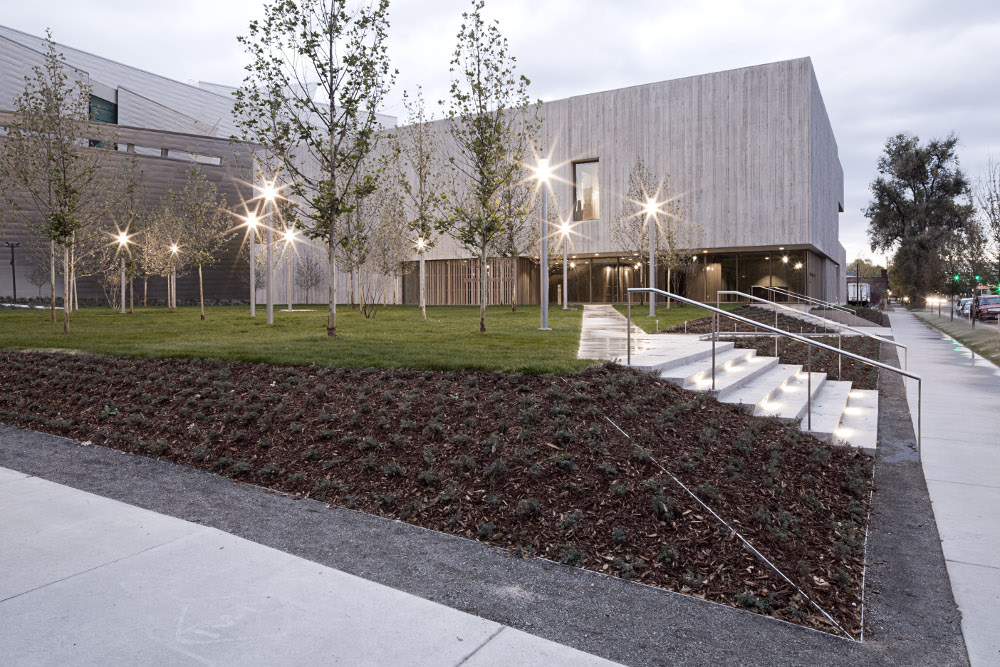
Outside the Clyfford Still Museum in Denver. Photo by Jeremy Bittermann, courtesy CSM.
After Still’s death, the works weren’t available to the public for more than two decades while his wife Patricia found and negotiated terms for a permanent space. She eventually chose Denver as the home for the collection, and the Clyfford Still Museum opened in 2011, more than 30 years after the artist died.
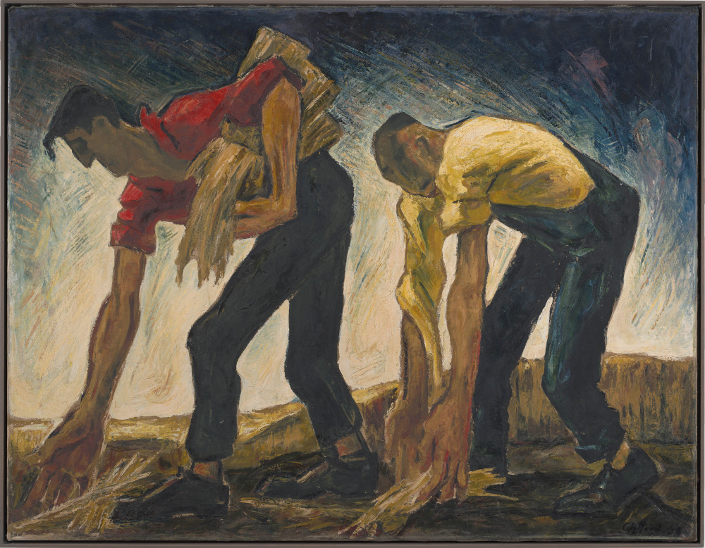
Last month (in February 2015) I had a chance to visit the museum for the first time. Still’s early works are reminiscent of other painters of the first half of the 20th century: Several echo Thomas Hart Benton, there’s a bit of Edward Hopper, and there was even a piece featuring drooping faces that was reminiscent of Salvador Dali’s “Persistence of Memory.” I’m not saying that Still was copying from other artists, but that to my eye, 80 or 90 years later, his early works don’t look distinct from others of that era.
This work, dated 1936, features angular lines foreshadowing those in Still’s later abstract paintings. Photo by Gary Regester, courtesy CSM.
The museum is arranged chronologically. After the first gallery of technically proficient but unexciting earlier work, visitors turn a corner into the second gallery, which contains figural paintings that Still created mostly in the 1930s. On their own, these pieces would also be unexciting to me, but I immediately recognized the mostly vertical, lightning-shaped lines that Still became famous for in his later abstract works. As the gallery progressed, the earthy, long-limbed figures became more and more abstract, and at the end, Still had realized that the line and shapes and composition were more interesting than the socialist-baggage-laden tillers and planters and mopers he’d been painting. Bam! Still was plowing new ground as one of the first Abstract Expressionists, exploring topics that were bigger than ordinary life. He’s now considered a founder of the movement, along with Mark Rothko and Jackson Pollock.
As I walked into the gallery displaying Still’s earliest abstract paintings, I saw a child run up to his father and ask, “Dad, do you know what this painting is of?” The father said something about the line being interesting and asked his child whether the shapes were interesting. The kid ran off.
To me, after seeing his earlier work and reading a bit about Still and his grandiose ideas about abstract art, these paintings were meant to capture and represent Truths that transcend what we normally focus on. He wanted to show that there were repetitive patterns under everything, and that those patterns could and should be seen and explored. The term “mystic” often pops up in talk about Still and contemporaries like Rothko. I wonder whether Still would respect other people seeing different patterns and exploring them, or whether he would insist that he had found the “real” patterns.
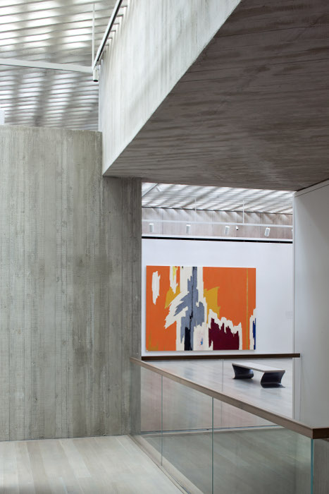
No “orange is the new” jokes please, this is serious Art. Photo by Bittermann, courtesy CSM.
The last two galleries in the museum showed the culmination of Still’s explorations of patterns that he’d gradually gleaned over years of looking at and thinking about the world. The paintings are large, mostly at least 10 feet by 10 feet, and some much larger. They represent his mature work as known to me and the rest of the general public. He’s been noted for his role as a “visionary loner” by the no-holds-barred art critic Robert Hughes:
All dialogue with other art, indeed all exchange with the culture around him, had stopped long before, and he was frozen by his own sense of grandiose outsidership in an art world whose corruptions he loudly despised – but which he skillfully manipulated himself …”
I walked into the Clyfford Still Museum not expecting to be impressed, but I thought it was my duty to visit, especially as the bulk of his work will never be exhibited outside of Denver. Before visiting the museum, I wasn’t a fan of his vertical, crunchy abstractions, and I certainly wasn’t a fan of him telling everyone what art should be about. I changed my mind though, and by the time I reached the final couple galleries of his larger pieces, I felt like a fan. I noticed forms he stuck with and explored over several paintings or even several decades, and I appreciated the experimental features in paintings that I may have previously thought were all overly similar.
I don’t think any of Clyfford Still’s paintings will ever be among my favorite images from mid-20th century art, but I admire him for his perseverance and insistence on us viewing his work in the context of his own work. I’m not sure if he was a genius or a grump or both, but it works at the museum in Denver. For me, visiting the Still Museum felt like a step into the artist’s mind. He didn’t consider other artists his equal, and insisted we view his work in that context. As far as I can recall from what I’ve read, Still worked hard and paid his bills by teaching, keeping his best art to himself. His insistence on not showing his paintings in the context of other artists worked, and it’s great to see that his wife found enough donors to create a museum that features most of his work.
I learned a lot more about Clyfford Still by seeing his works together than I ever would have if I’d seen them surrounded by the work of his peers or historical bookends.
Who doesn’t enjoy their behind getting felt? Photo courtesy CSM.
I visited the museum with my aunt Jon and my cousin Ed. We stopped by around noon on Superbowl Sunday and had some of the galleries to ourselves. I was impressed with the chronological layout and succinct descriptions of Still’s career, and I think my companions were too. We were all impressed with the bench seats, which were made of simple, two-inch-thick pieces of gray felt. An activity room seemed to keep children entertained, and the Clyfford Still jigsaw puzzle there kept us entertained for a few minutes. As noted by another blogger before the puzzle was available, it was “being produced by hand locally, in a very low volume, and will be sold only at the shop.” It’s there now and available for $275.

The limited availability of the Still jigsaw puzzle matches the spirit of the artist’s will. Photo courtesy CSM.
Too bad not all artists are as strong-minded as Clyfford Still. Or maybe not. One Clyfford Still is probably enough, and he did a good job of it. It could be a remnant from another era, but I can’t shake the belief that art should be unique, and I respect artists whose work is distinctive, more than any other quality. Perhaps it’s the result of the fact that I was a child of Modernism, at least in my mind. That’s what I thought I was up against in college, when I had my first hint of being an artist in the context of other artists.
I think that uniqueness is still the most overlooked quality in contemporary art. Historically, art may be well past that stage and back again several times over, joking about the effort to be original instead of truly striving to create something new, but I’m still impressed with pioneers like Clyfford Still.
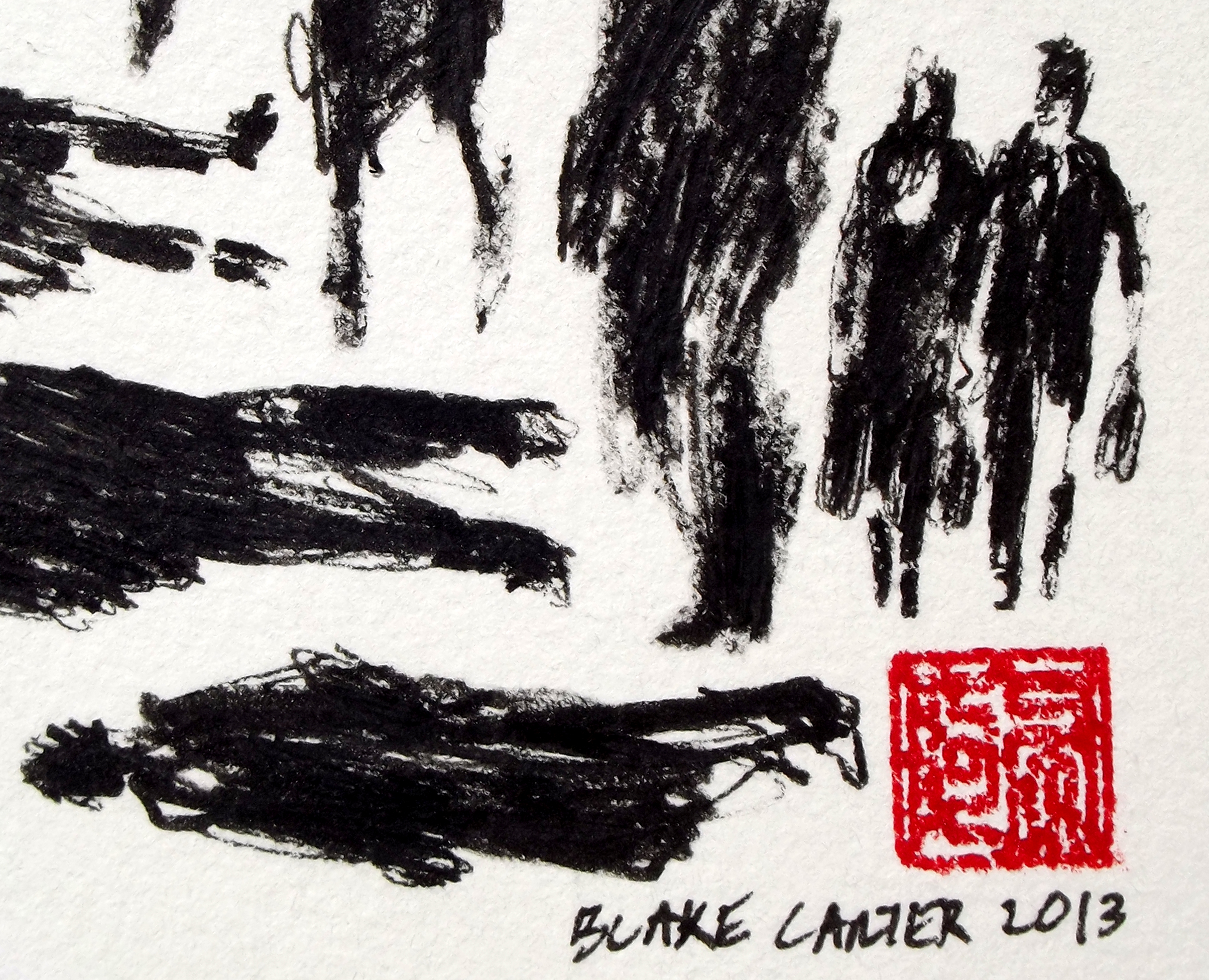
Filed under: SCRAPS | Tags: because america, Blake Carter, chinese characters, contemporary art, contemporary drawing, ink drawing, northwest art, seattle art, tacoma art, wood panel
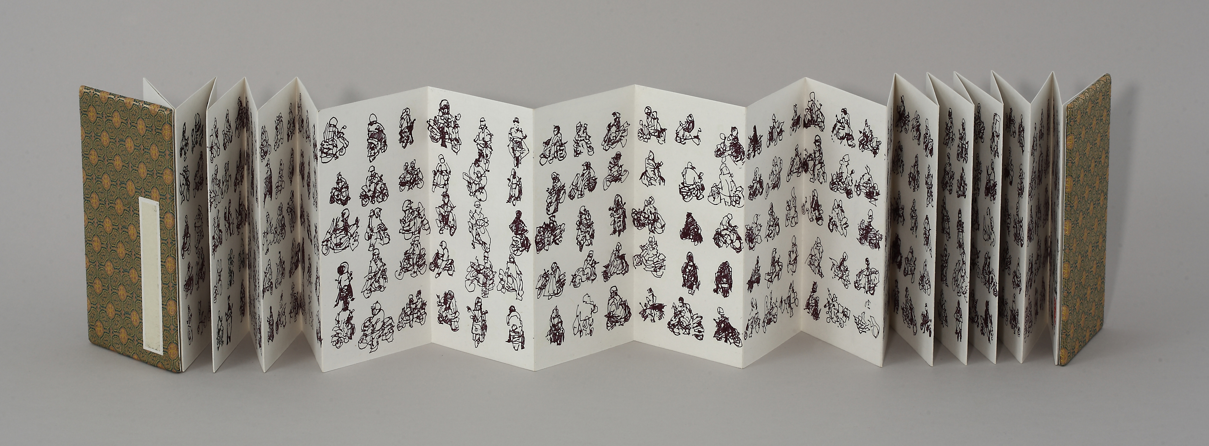
The first completed piece in my Scooter Series, drawn en plein air at Taipei intersections in 2009.
I’ve spent about half of my life outside the US, my home country. My father was in the Air Force, and while I was growing up we lived on and off military bases in Taiwan, Japan and Germany. After attending junior high, high school, and college in the US, I got itchy feet, and spent 11 of the next 15 years living and traveling in Southeast and East Asia.
I returned to the States three years ago. I’ve posted before about my Pedestrian Series, which grew out of my Scooter Series, a project that ended soon after I found myself in this land bereft of Yamaha Super Fuzzys and other stars of the Taiwanese intersection.
My latest Pedestrian Series piece, 1,040 Americans, is a tribute to America and Americans, the greatest people ever to insist on the name of an entire continent as their moniker. Watch, learn, and enjoy.
Filed under: 2013.APRIL | Tags: art, california, contemporary art, etching, how to etch, modern art

My first proof of 61 Pedestrians (Etching).
I love to try new things, and it’s tempting for me to abandon everything I’ve learned each time I begin a project. Experience has shown, however, that starting anew isn’t always the best way forward. My art progresses the most when I select what I like about a piece or a series, keep that constant, and limit my variables.
With that in mind, I decided that my first foray into zinc-plate etching should expand on something I’m already very familiar with — my Pedestrian Series (examples on my website).
As the images in the series are line-based, I chose to work with a hard ground. That means I coated my zinc plate with a thin, brown layer of waxy “ground,” let it dry, and then carved my image into the ground with a stylus called a Whistler’s needle. The lines that I scratched into the wax exposed the shiny zinc plate below. I then set the plate in an acid bath so that the exposed lines were etched into the plate, while the waxy ground protected the rest of the plate.
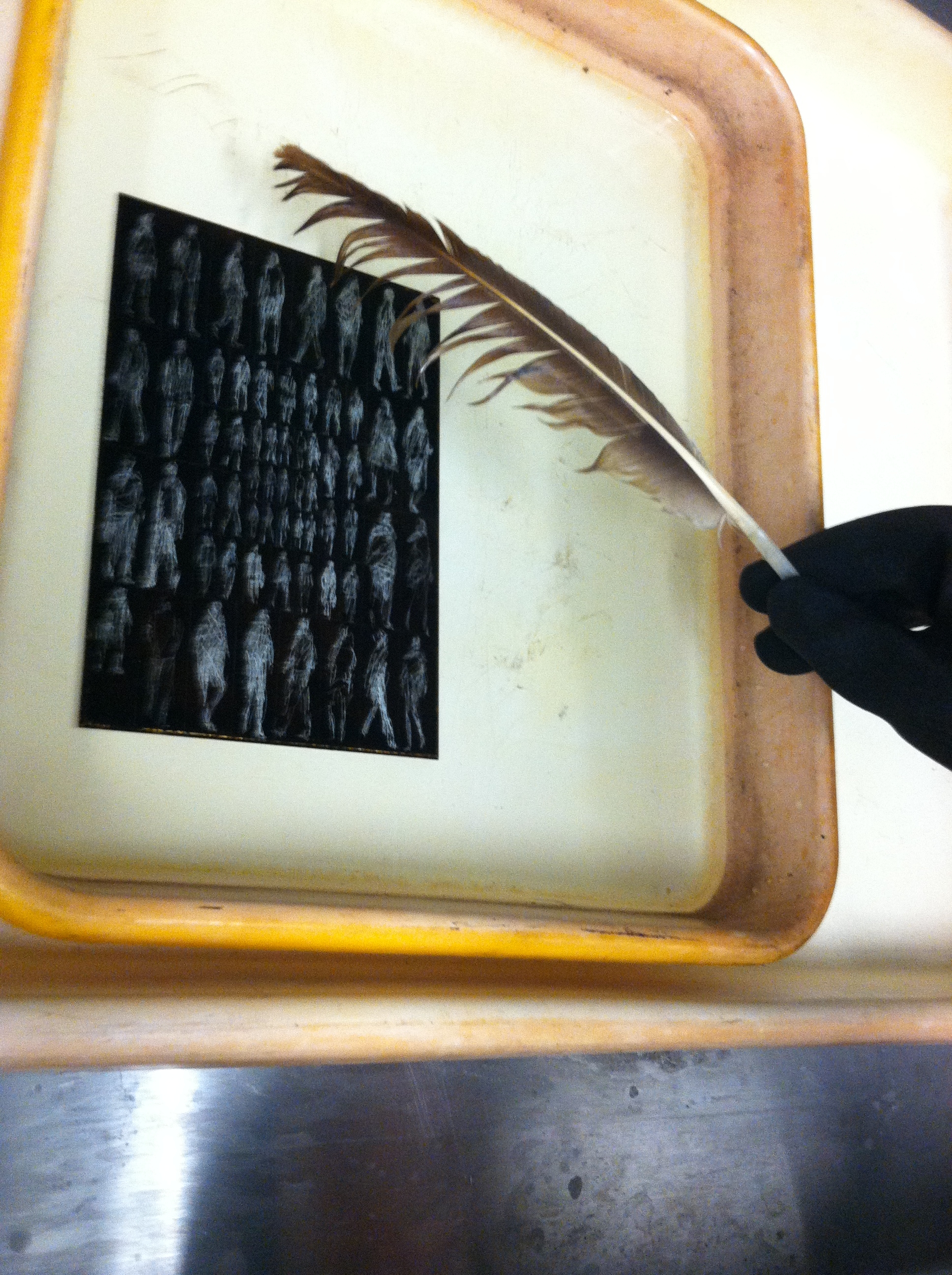
The delicate de-bubbling process.
In the above picture you see my plate in the acid bath. The light figures are the places where I carved away the waxy ground with my Whistler’s needle, and the dark background is the ground. The reaction of the acid and the exposed zinc plate creates small bubbles that need to be brushed off with a feather, or else they’ll leave a small bubble pattern that will distort the lines.
After etching the plate in the acid batch and cleaning off the ground with mineral spirits, I had a clean zinc plate with tiny grooves etched into it. This was covered in ink and then carefully wiped off, leaving ink in the grooves, but not on the surface of the plate. I then set a piece of paper on the plate and ran it through a very tight press, pushing the fibers of the paper into the inked grooves, and wa-lah! — the image you see at the top of this post.

That’s the spirits.
It all sounds simple enough, but it does take time, especially while you’re inking and wiping the plate prior to printing. You can only run the plate through the press once, for a single print, and then you need to ink and wipe again, which takes at least ten minutes. Whenever you finish printing, the plate can be cleaned with mineral spirits and stored until you’re ready to ink-wipe-print again.
I have two more days in the printmaking studio at Golden West College here in Huntington Beach, and I plan to use them experimenting with different inking/wiping techniques. For my first proof I left a lot of “plate tone” to give it a must old-fashioned look, and I want to see what a print will look like if I wipe a little more for a cleaner image.
If any of you have etching experience, let me know if you have any suggestions. If you don’t, I wonder if my description of the process made sense to you — it’s all pretty easy if you’re doing it. Feel like you know how it works?
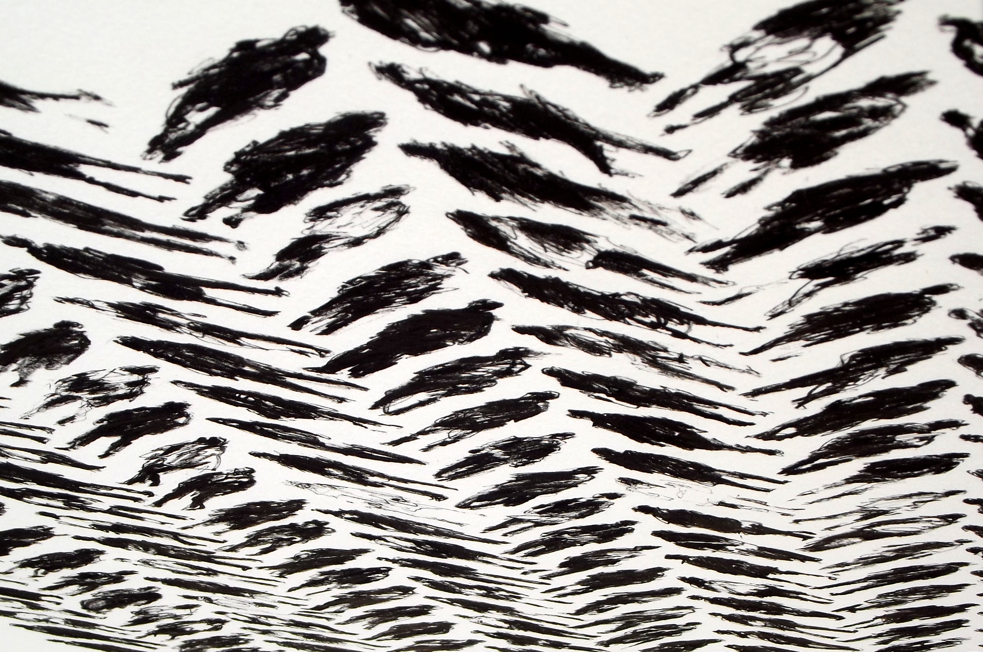
Filed under: 2013.FEBRUARY, SCRAPS | Tags: art, asian art, California art, Chinese calligraphy, contemporary art, ink painting, Orange County art
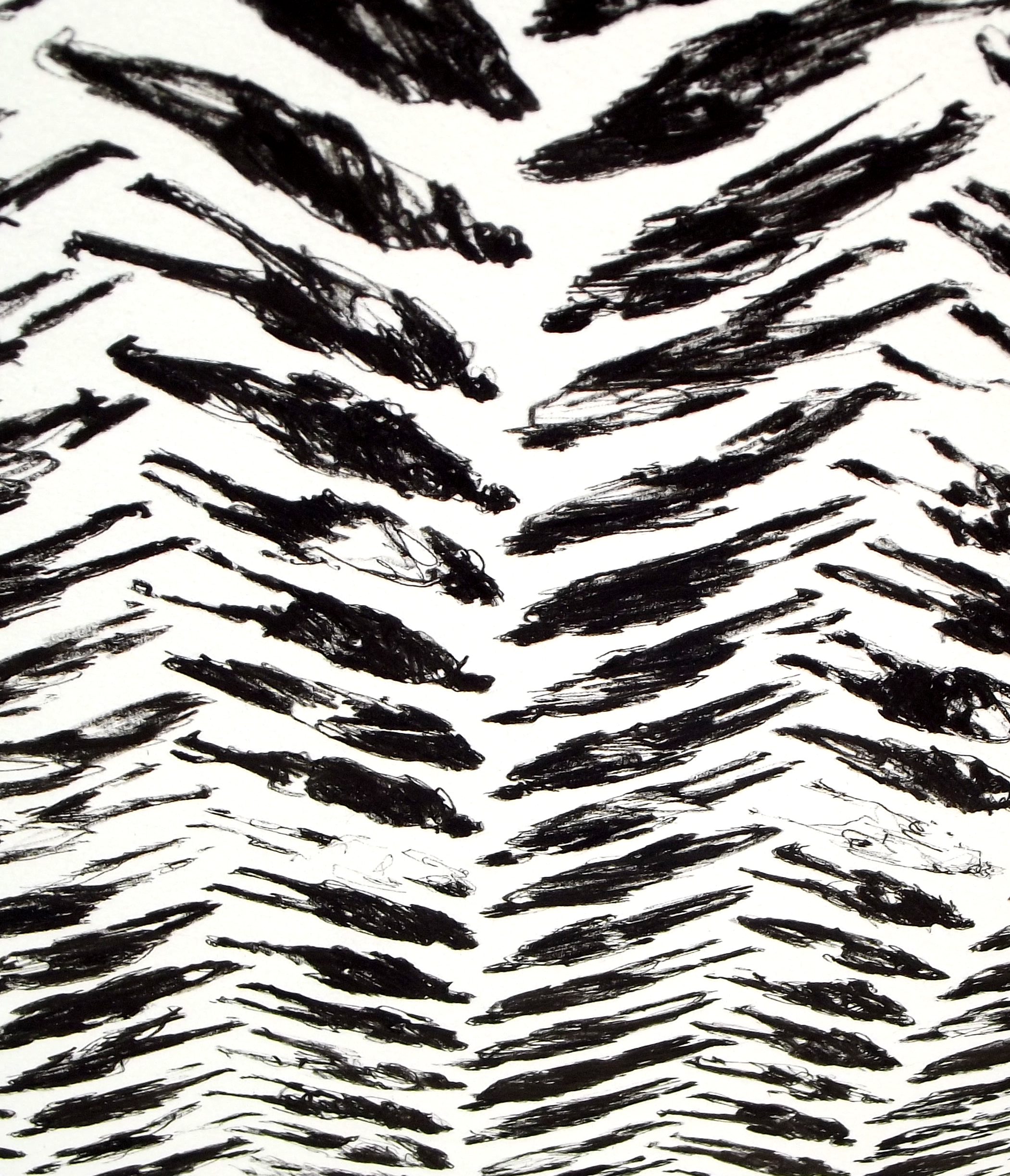
163 Pedestrians (Tread) – DETAIL 1
30×22 inches
Ink on paper
I’ve been working on my Pedestrian Series since I moved from Taiwan to California in late 2011. So far all the pieces are ink on paper. I like scribbling out rough-looking figures and arranging them in neat grids, something like the looser styles of Chinese calligraphy. In my earlier works from the series, I lined the figures up in a very straightforward manner. Every figure in a piece took up the same amount of space, and they were placed in simple columns and rows.
Above and below are details from my latest piece in the series, 163 Pedestrians (Tread). The full piece can be viewed here. Recently I’ve been toying with patterns, and I came up with the layout of Tread while thinking about basic weave patterns. I like the way the picture plane looks three-dimensional from different angles.

163 Pedestrians (Tread) – DETAIL 2
163 Pedestrians (Tread) – DETAIL 3
163 Pedestrians (Tread) – DETAIL 4
Once I get a few more images of my newer work ready, I’ll compare the different patterns I’ve been experimenting with.
Filed under: SCRAPS, Uncategorized | Tags: art technique, chuck close, contemporary art, de kooning, fragonard, franz kline, goya, jim morrison, leibovitz, modern art, rembrandt, sakura
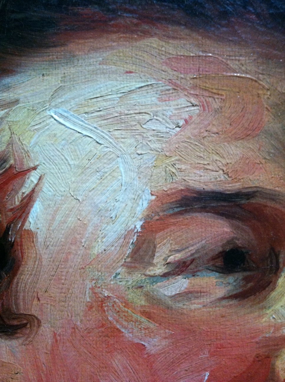
Jean-Honore Fragonard, Francois-Henri, Duke of Harcourt (Detail 1), ~1769
I’ve been thinking of this painting by Jean-Honore Fragonard since I saw it a couple weeks ago at the Getty in Los Angeles (detail above). It’s certainly not the kind of thing I’d expect from the painter of The Swing and other cloying confections. The impasto brushwork looks more like something you’d expect from Goya or Rembrandt. And wouldn’t you know it, Frago admired and sometimes copied Rembrandt’s paintings, according to John Canaday in The Lives of the Painters. (By the way, the excellent-condition, four-volume, used hardcover Lives is by far the best US$4 I ever spent on Amazon. Think I may have overpaid — there’s a set on Amazon now for $3.64.)

Detail 2
Stepping back a bit the head emerges. I wonder if a less confident artist would have tried to blend in the four grey marks on the duke’s jowls.
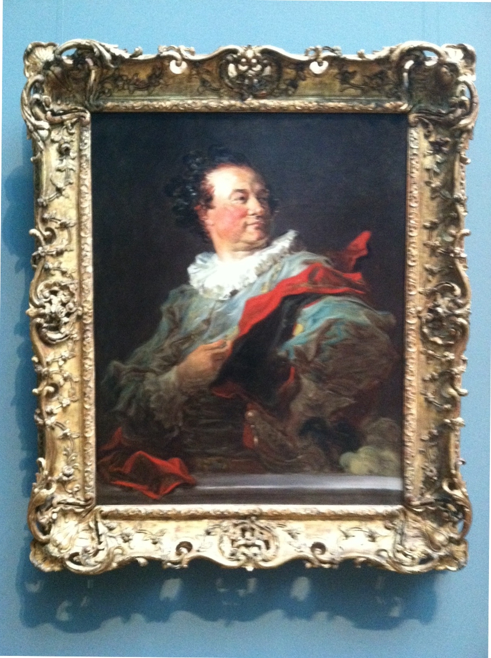
Fragonard, Francois-Henri, Duke of Harcourt
Here’s the full picture, above. Don’t know if I would have been terribly interested to take a closer look if I’d just seen this image in a book. There’s an affected gallantry that I imagine the subject loved, but it strikes me as a little over the top. Glad I did though. The placard next to this painting notes that Frago spent “as little as an hour to complete each of the canvases” of the series that includes this work, which helps explain the “bravura brushwork of rapid, fluid strokes.”
I’m particularly interested in this Fragonard painting right now because I’ve been working on a similar effect in my Pedestrian Series. I discussed the difficulty of photographing my work and the importance of viewing my work in person in an earlier post. Below is a detail from my last work of 2012:

Blake Carter, 335 Pedestrians (Skull) (Detail 1), 2012
Recently I decided to try something that I’ve been knocking around for a while. I’ve been drawing figures with Sakura Pigma pens and Faber-Castell PITT Artist pens for a few years and feel I have a bit of control with them, despite the fact my process is reliant on a lot of “happy accidents” that occur while I’m scribbling. In the detail above you can see the variety of marks I use.

Detail 2
From the little distance of the image above (detail appr 2×3 inches), it’s obvious the marks in my piece describe individual figures. There are parts with heavier marks, and parts with lighter marks.

Detail 3
Now you see what I’m getting at. By altering the weight of the marks in each figure, I can use the smaller figures to create a larger image.

Carter, 335 Pedestrians (Skull)
There’s the full piece, above. Nothing revolutionary. When I was in high school, the art teacher gridded out a Leibovitz picture of Jim Morrison and had her students each draw a small piece (maybe a foot square), then arranged them all and hung them in the lunchroom. Chuck Close also comes to mind, as well as every super-realist who talks about concentrating on the individual grids in an image and treating them as small, abstract paintings that add up to completed pieces resembling photographs.
It’s a simple idea, but it’s very important when looking at art, and paintings in particular. Any figurative or landscape piece can be broken up into an infinite number of smaller, abstract images. I’m currently reading a book about Alice Neel (Alice Neel: The Art of Not Sitting Pretty by Phoebe Hoban), who worked in New York in the middle of the last century, a time when critics and artists vigorously proclaimed allegiance to abstract versus figurative art.
They all seem a bit silly now. If I fail to see the figure of a woman in a painting from de Kooning’s Woman Series, is it abstract? What if I think Franz Kline’s work looks derivative of Chinese characters — does that make it more based in visual reality?
Filed under: 2012.NOVEMBER, SCRAPS | Tags: art, California art, calligraphy, chinese art, contemporary art, ink, women
 (Detail 1)")
Killer bees attack (column 12, row 2).
Above and below are details from 255 Pedestrians (and Stroller), completed late last night. As in most of my recent works, I’m playing around with ways to make marks using Sakura Pigma Graphic and Sakura Pigma Micron pens. I’ve also been trying to push myself to draw more women. For some reason Freudian or otherwise, I tend to enmasculate females when I’m drawing. I figure it’s something to do with mirrors. Regardless, I don’t often hear complaints that there are too many women around.
 (Detail 2)")
Shrunken-head Pablo (column 11, row 11).
 (Detail 3)")
Stretch pants (column 5, row 14).
 (Detail 4)")
This is one of my favorites from this piece. No pedestrian really, just scribbly swirls.
 (Detail 5)")
Some of these lines cut into the paper, so up close this almost looks like bas relief (column 6, row 8).
 (Detail 6)")
I wanted suggestion to play a big part in this drawing. Does this woman have feet? (column 1, row 2)
Eventually I’ll get an image of the final piece up on my gallery of finished works, for now it’s on my Facebook page.
Filed under: 2012.NOVEMBER, SCRAPS | Tags: art, art technique, calligraphy, China, chinese art, Chinese calligraphy, contemporary art, drawing, ink, modern art, scroll painting
")
In my previous post I noted how differently pieces from my Pedestrian Series look in real life and in photographs. Here are more close-ups, this time from 255 Pedestrians, a piece I finished yesterday. Watch the figure above as you scroll down. Starting with her, I zoom out to show the surrounding eight figures, then the sixteen figures surrounding those, and etc, up to the finished work.
")
")
")
")

Filed under: 2012.NOVEMBER, SCRAPS | Tags: art, art technique, California art, calligraphy, China, chinese art, contemporary art, ink, scroll painting
 (Detail)")
The above detail is about 2.5 inches across. One thing my ongoing show in Laguna has taught me is that my current works look much, much better in real life than they do in photographs or on a monitor. The most basic problem is that the plane of our eyes’ focus changes constantly, and this is impossible to achieve with a camera. Even line art on the slickest vellum looks much better to the eye than it ever could in print. In a previous post I noted how happy I was that a friend and collector chose to hang my work at the end of the entrance hallway of his house; the pride of place was flattering, but I also know that people entering his door will see my piece from a distance first, and then their focus will change as they approach the wall on which it’s hung.
Below are five works I’ve completed since sending pieces for my current show to the framer. I’ve been experimenting around with my Pedestrian Series:

Now here’s what I love most about this series. Each figure is composed of rough, abstract lines and forms that together add up to the images you see from a distance. In a photograph, these forms are only visible in a close-up view:
")
In these details, you can see how the ink is sometimes jammed down into the porous watercolor paper, while at other times the pen has been roughly slid along the surface, and still others, the ink sits atop the paper in a layer:
 (Detail)")
I’ve been playing around with introducing color into these works. Below is a detail of a piece that includes marks using Prismacolor Premier markers, but I’m not sure if I like the way the ink soaks into the paper so easily. You can tell the difference between the thick orange lines (Prismacolor) and the fine red lines (my usual Sakura pens) flaring out from the figures:
 (Detail)")
Here’s another experiment. For this piece I coated the paper with a layer of black acrylic paint, and then scraped the white forms out with an X-acto blade:
 (Detail)")
Another view of the same piece, showing how the individual images look up close and further away. Only with the naked eye can you see both views of the same image at the same time.
 (Detail II)")
