
Filed under: 2014.JANUARY, GICKERS | Tags: abstract art, bacon, Blake Carter, de kooning, figure, hirshhorn, museums, paintings, pollock
Sometimes I’m happiest when I change my mind. I treated everyday driving like a sport when I was a teenager, I didn’t like spinach or asparagus until my 30s, and I only recently admitted to myself that I enjoy listening to U2. I suppose it’s just maturing, but I like to think of it as a willful broadening of the mind. I try to suspend judgment and see things more objectively.
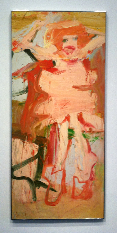
Willem de Kooning, Woman, 1965
Like responsible driving and vegetables, Willem de Kooning somehow got filed under “dull establishment drivel” when I first saw images of his work. It’s hard to imagine the me that overlooked his paintings as an art major. There was a bit of a spark when I saw slides of de Kooning’s Woman series, but I let it die out. I found Jackson Pollock edgier, and I preferred the contemporary scenery in Francis Bacon’s paintings to de Kooning’s experiments melding the figural with the abstract.
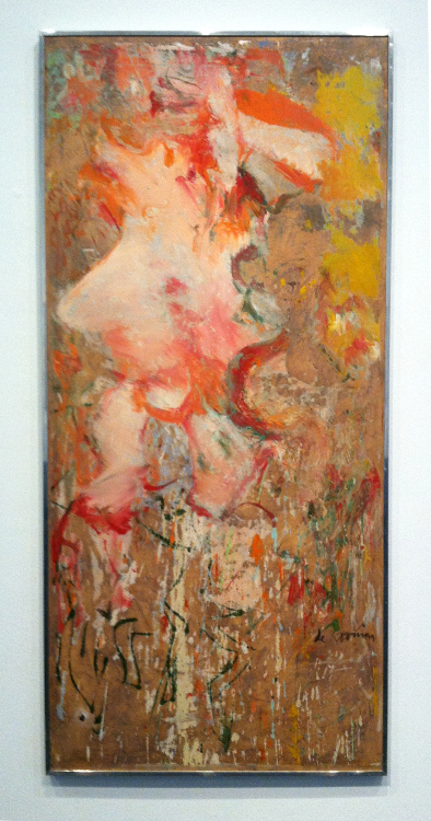
Willem de Kooning, Woman, 1964
Last summer’s trip to the Hirshhorn Museum in Washington, DC confirmed the folly of my youth. I now know that de Kooning could have painted as realistically as he wanted, and I don’t see his work as sloppy or contrived, which I guess is what I thought when I first encountered them. Now when pigment hits substrate, I appreciate a painting about pigment hitting substrate.
I like painters who balance the physical aspects of placing pigment on substrate with allusions to form we see in the everyday world. I enjoy finding the fulcrum, and I respect artists whose work makes me question where the fulcrum lies.
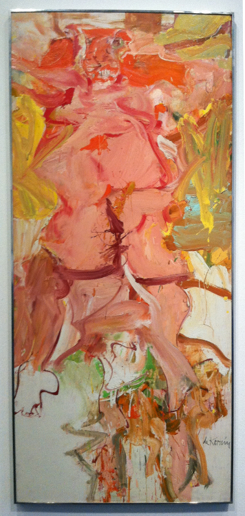
Willem de Kooning, Woman, 1964
Willem de Kooning’s Woman Series does this for me, and seeing several pieces in the same gallery at the Hirshhorn challenged me to compare my idea of form vs abstraction to his. We can’t all visit Washington, DC when we want to, but looking at these pictures took me back to my experience there. I wonder what de Kooning saw when he finished these paintings, and how it relates to what we see now. This series has been called angry, elegant, playful, intellectual – even misogynistic.
What do you see when you look at these images?
Filed under: SCRAPS, Uncategorized | Tags: art technique, chuck close, contemporary art, de kooning, fragonard, franz kline, goya, jim morrison, leibovitz, modern art, rembrandt, sakura
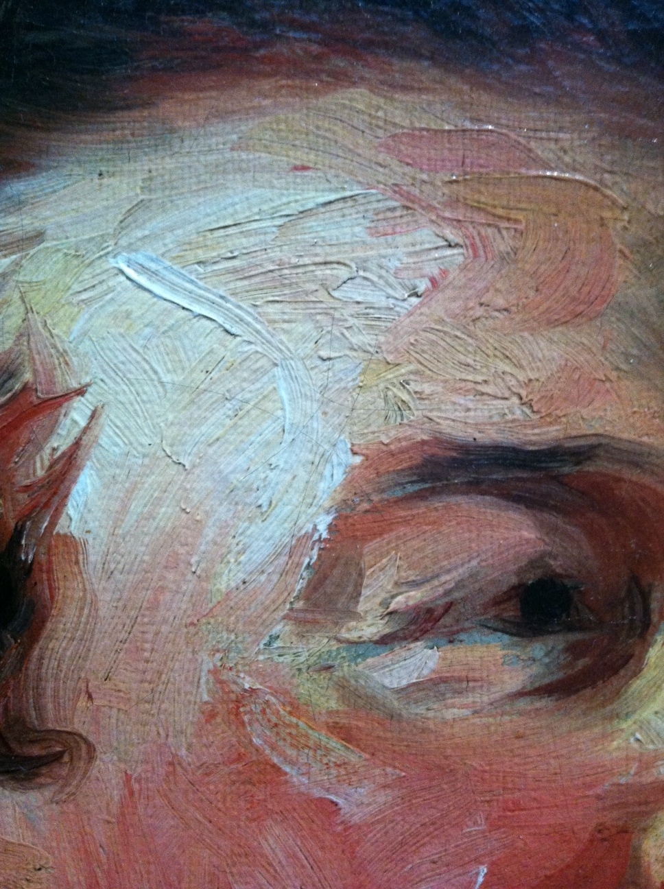
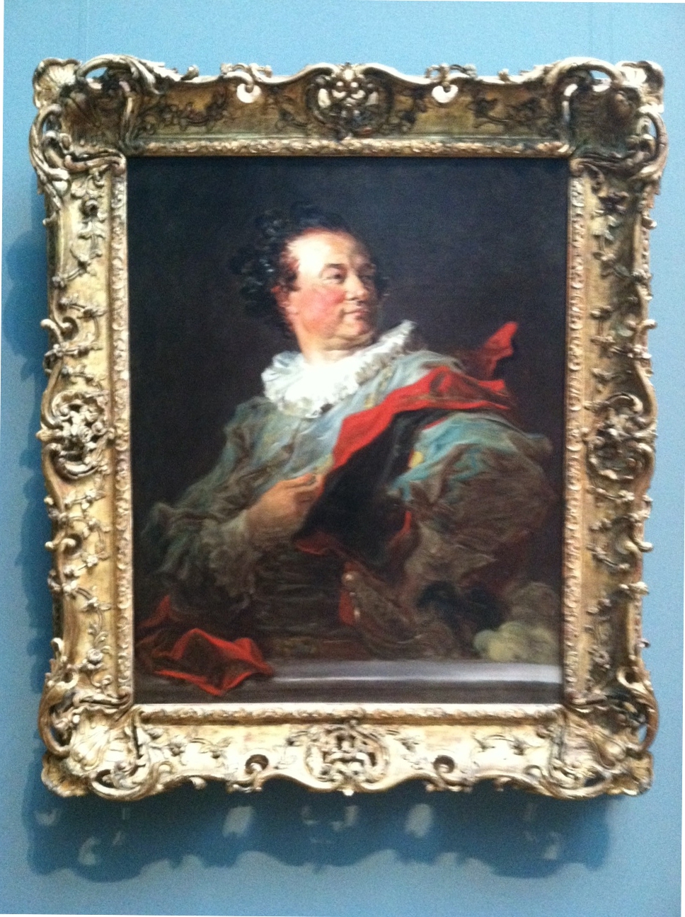
Jean-Honore Fragonard, Francois-Henri, Duke of Harcourt (Detail 1), ~1769
I’ve been thinking of this painting by Jean-Honore Fragonard since I saw it a couple weeks ago at the Getty in Los Angeles (detail above). It’s certainly not the kind of thing I’d expect from the painter of The Swing and other cloying confections. The impasto brushwork looks more like something you’d expect from Goya or Rembrandt. And wouldn’t you know it, Frago admired and sometimes copied Rembrandt’s paintings, according to John Canaday in The Lives of the Painters. (By the way, the excellent-condition, four-volume, used hardcover Lives is by far the best US$4 I ever spent on Amazon. Think I may have overpaid — there’s a set on Amazon now for $3.64.)

Detail 2
Stepping back a bit the head emerges. I wonder if a less confident artist would have tried to blend in the four grey marks on the duke’s jowls.
Fragonard, Francois-Henri, Duke of Harcourt
Here’s the full picture, above. Don’t know if I would have been terribly interested to take a closer look if I’d just seen this image in a book. There’s an affected gallantry that I imagine the subject loved, but it strikes me as a little over the top. Glad I did though. The placard next to this painting notes that Frago spent “as little as an hour to complete each of the canvases” of the series that includes this work, which helps explain the “bravura brushwork of rapid, fluid strokes.”
I’m particularly interested in this Fragonard painting right now because I’ve been working on a similar effect in my Pedestrian Series. I discussed the difficulty of photographing my work and the importance of viewing my work in person in an earlier post. Below is a detail from my last work of 2012:

Blake Carter, 335 Pedestrians (Skull) (Detail 1), 2012
Recently I decided to try something that I’ve been knocking around for a while. I’ve been drawing figures with Sakura Pigma pens and Faber-Castell PITT Artist pens for a few years and feel I have a bit of control with them, despite the fact my process is reliant on a lot of “happy accidents” that occur while I’m scribbling. In the detail above you can see the variety of marks I use.

Detail 2
From the little distance of the image above (detail appr 2×3 inches), it’s obvious the marks in my piece describe individual figures. There are parts with heavier marks, and parts with lighter marks.

Detail 3
Now you see what I’m getting at. By altering the weight of the marks in each figure, I can use the smaller figures to create a larger image.

Carter, 335 Pedestrians (Skull)
There’s the full piece, above. Nothing revolutionary. When I was in high school, the art teacher gridded out a Leibovitz picture of Jim Morrison and had her students each draw a small piece (maybe a foot square), then arranged them all and hung them in the lunchroom. Chuck Close also comes to mind, as well as every super-realist who talks about concentrating on the individual grids in an image and treating them as small, abstract paintings that add up to completed pieces resembling photographs.
It’s a simple idea, but it’s very important when looking at art, and paintings in particular. Any figurative or landscape piece can be broken up into an infinite number of smaller, abstract images. I’m currently reading a book about Alice Neel (Alice Neel: The Art of Not Sitting Pretty by Phoebe Hoban), who worked in New York in the middle of the last century, a time when critics and artists vigorously proclaimed allegiance to abstract versus figurative art.
They all seem a bit silly now. If I fail to see the figure of a woman in a painting from de Kooning’s Woman Series, is it abstract? What if I think Franz Kline’s work looks derivative of Chinese characters — does that make it more based in visual reality?
