
Filed under: SCRAPS | Tags: because america, Blake Carter, chinese characters, contemporary art, contemporary drawing, ink drawing, northwest art, seattle art, tacoma art, wood panel
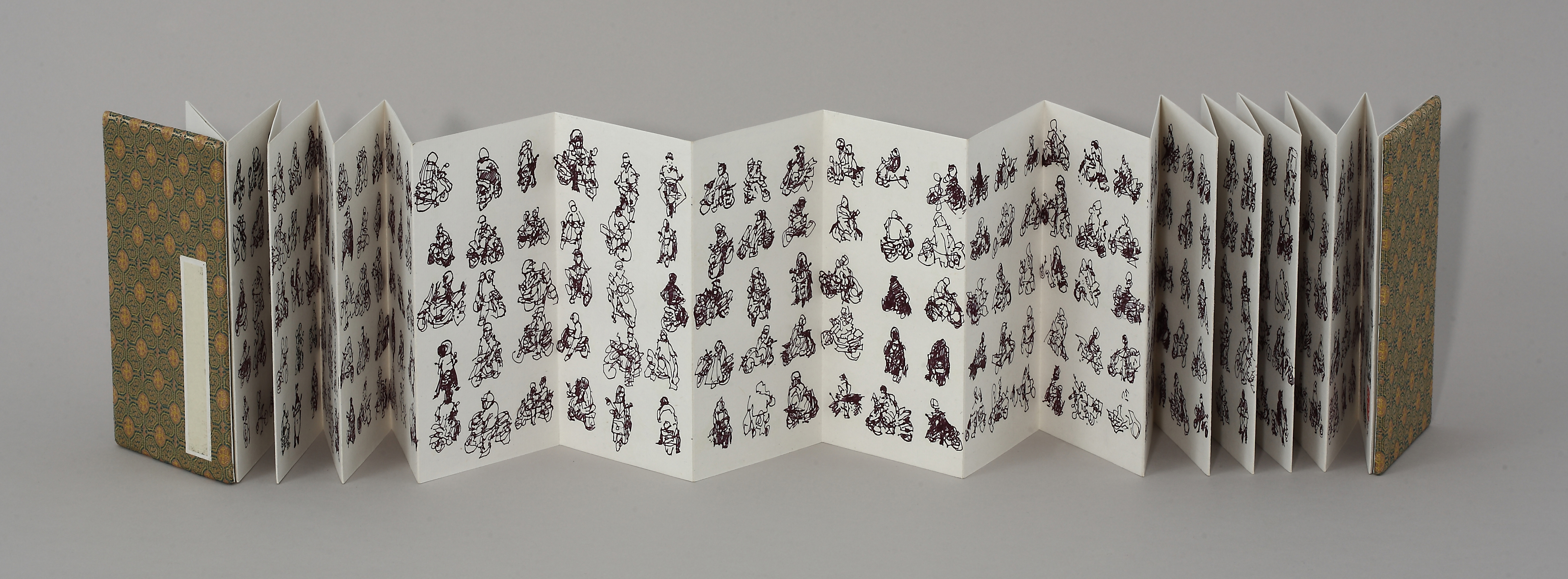
The first completed piece in my Scooter Series, drawn en plein air at Taipei intersections in 2009.
I’ve spent about half of my life outside the US, my home country. My father was in the Air Force, and while I was growing up we lived on and off military bases in Taiwan, Japan and Germany. After attending junior high, high school, and college in the US, I got itchy feet, and spent 11 of the next 15 years living and traveling in Southeast and East Asia.
I returned to the States three years ago. I’ve posted before about my Pedestrian Series, which grew out of my Scooter Series, a project that ended soon after I found myself in this land bereft of Yamaha Super Fuzzys and other stars of the Taiwanese intersection.
My latest Pedestrian Series piece, 1,040 Americans, is a tribute to America and Americans, the greatest people ever to insist on the name of an entire continent as their moniker. Watch, learn, and enjoy.
Filed under: 2013.FEBRUARY, SCRAPS | Tags: art, asian art, California art, Chinese calligraphy, contemporary art, ink painting, Orange County art
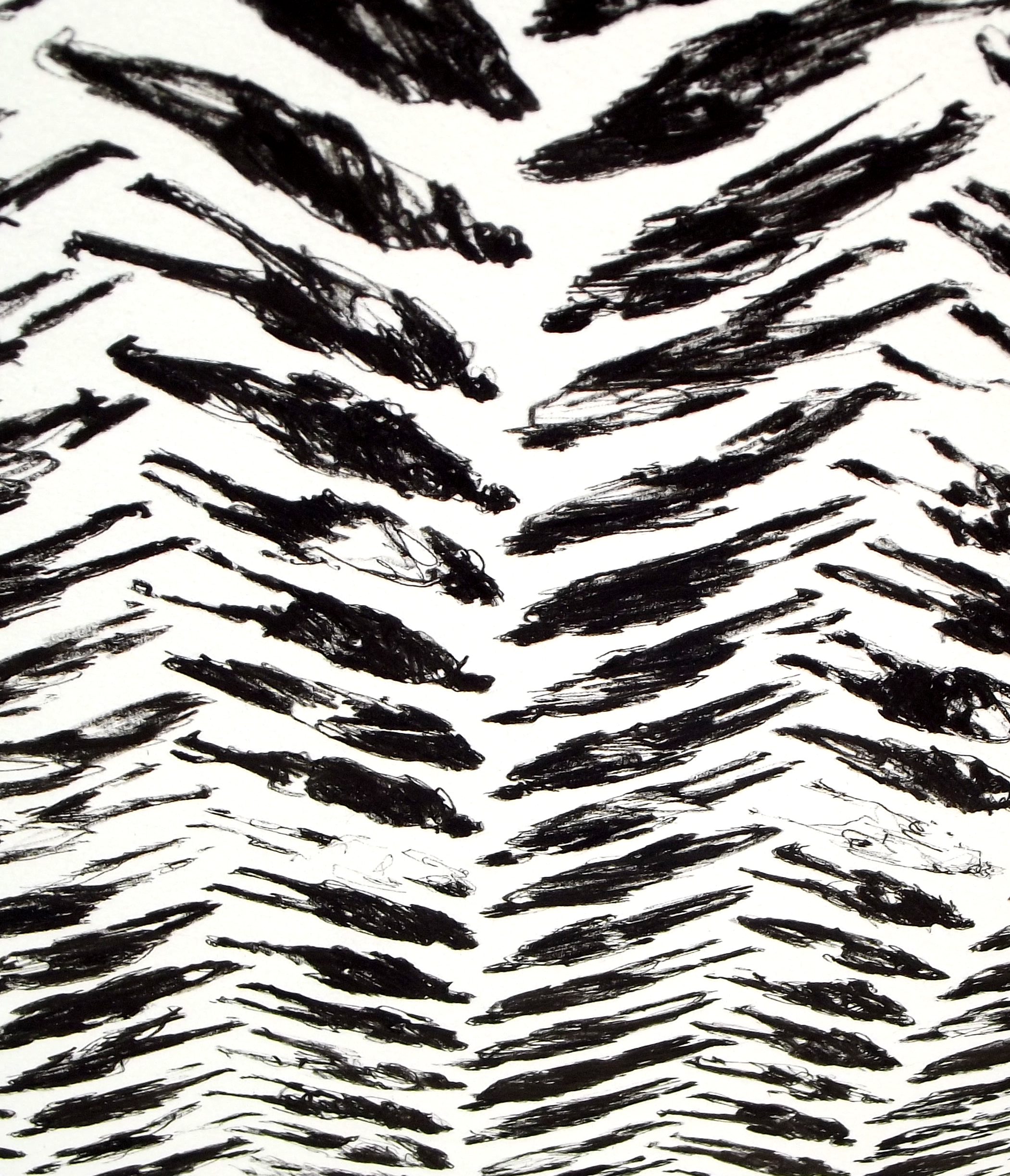
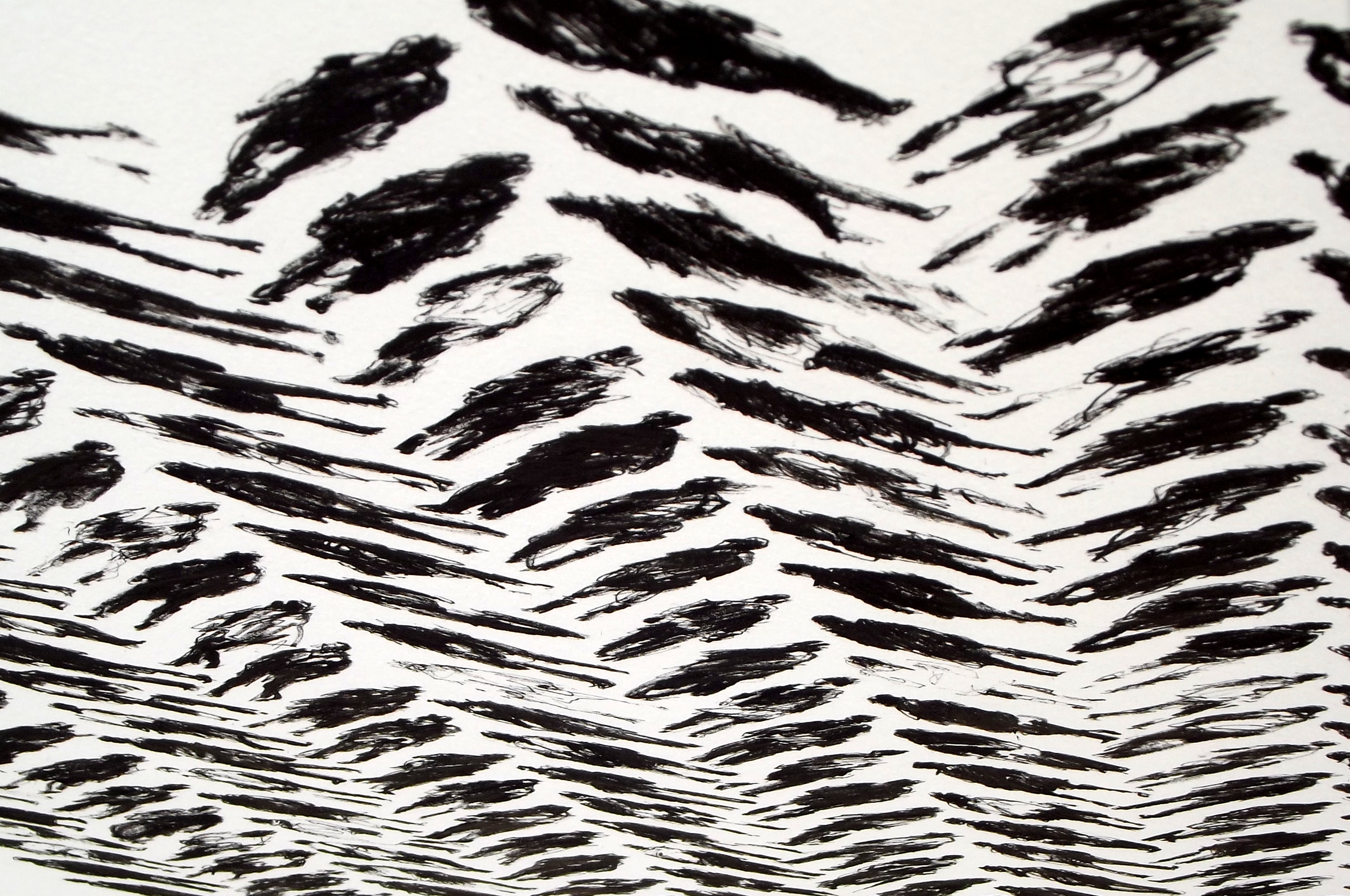
163 Pedestrians (Tread) – DETAIL 1
30×22 inches
Ink on paper
I’ve been working on my Pedestrian Series since I moved from Taiwan to California in late 2011. So far all the pieces are ink on paper. I like scribbling out rough-looking figures and arranging them in neat grids, something like the looser styles of Chinese calligraphy. In my earlier works from the series, I lined the figures up in a very straightforward manner. Every figure in a piece took up the same amount of space, and they were placed in simple columns and rows.
Above and below are details from my latest piece in the series, 163 Pedestrians (Tread). The full piece can be viewed here. Recently I’ve been toying with patterns, and I came up with the layout of Tread while thinking about basic weave patterns. I like the way the picture plane looks three-dimensional from different angles.

163 Pedestrians (Tread) – DETAIL 2
163 Pedestrians (Tread) – DETAIL 3
163 Pedestrians (Tread) – DETAIL 4
Once I get a few more images of my newer work ready, I’ll compare the different patterns I’ve been experimenting with.
Filed under: SCRAPS, Uncategorized | Tags: art technique, chuck close, contemporary art, de kooning, fragonard, franz kline, goya, jim morrison, leibovitz, modern art, rembrandt, sakura
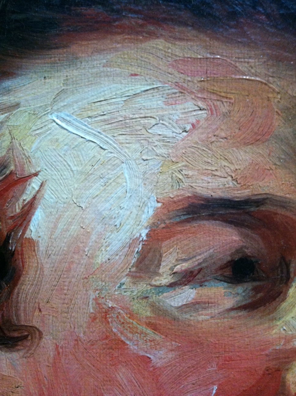
Jean-Honore Fragonard, Francois-Henri, Duke of Harcourt (Detail 1), ~1769
I’ve been thinking of this painting by Jean-Honore Fragonard since I saw it a couple weeks ago at the Getty in Los Angeles (detail above). It’s certainly not the kind of thing I’d expect from the painter of The Swing and other cloying confections. The impasto brushwork looks more like something you’d expect from Goya or Rembrandt. And wouldn’t you know it, Frago admired and sometimes copied Rembrandt’s paintings, according to John Canaday in The Lives of the Painters. (By the way, the excellent-condition, four-volume, used hardcover Lives is by far the best US$4 I ever spent on Amazon. Think I may have overpaid — there’s a set on Amazon now for $3.64.)

Detail 2
Stepping back a bit the head emerges. I wonder if a less confident artist would have tried to blend in the four grey marks on the duke’s jowls.
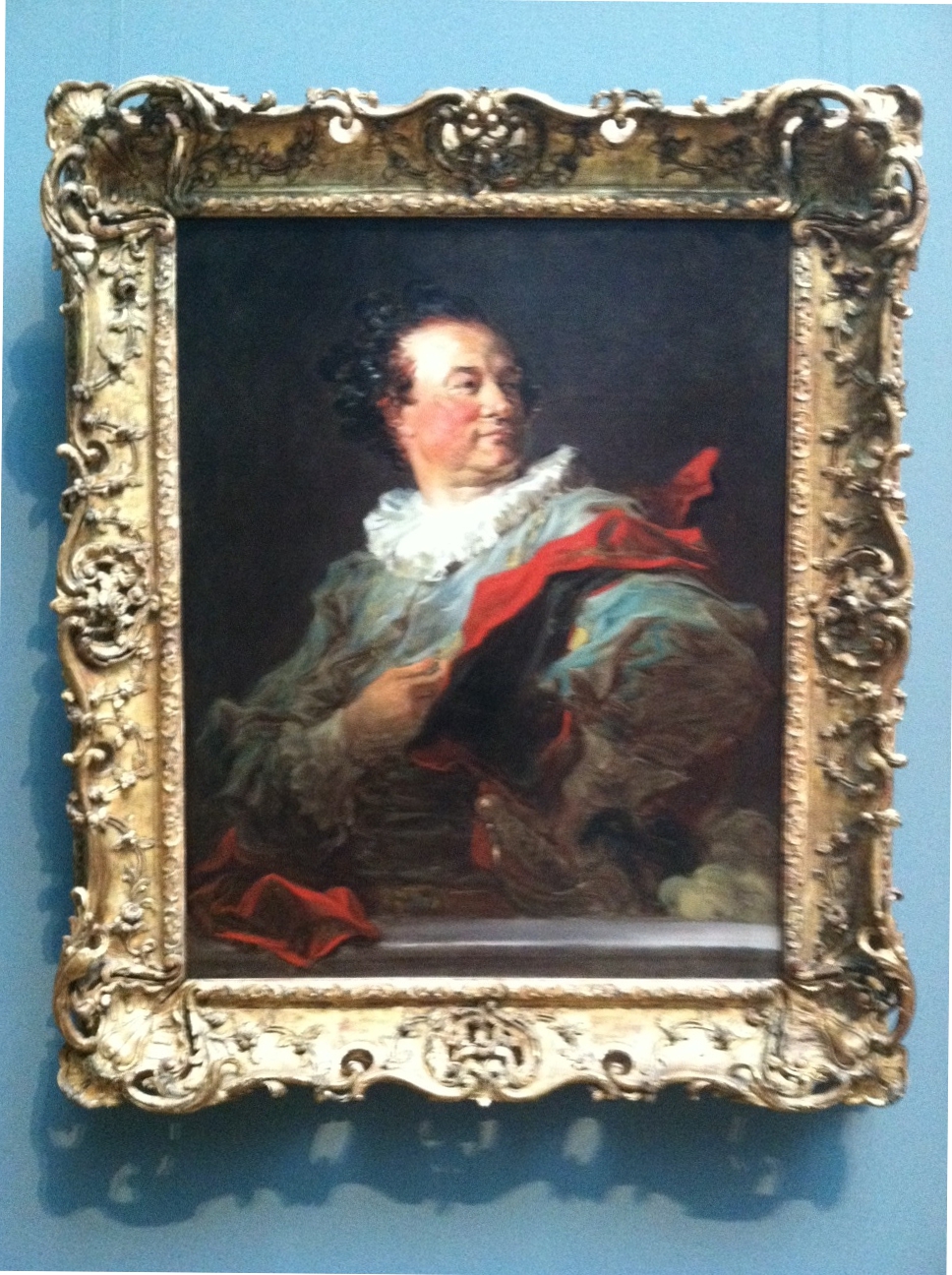
Fragonard, Francois-Henri, Duke of Harcourt
Here’s the full picture, above. Don’t know if I would have been terribly interested to take a closer look if I’d just seen this image in a book. There’s an affected gallantry that I imagine the subject loved, but it strikes me as a little over the top. Glad I did though. The placard next to this painting notes that Frago spent “as little as an hour to complete each of the canvases” of the series that includes this work, which helps explain the “bravura brushwork of rapid, fluid strokes.”
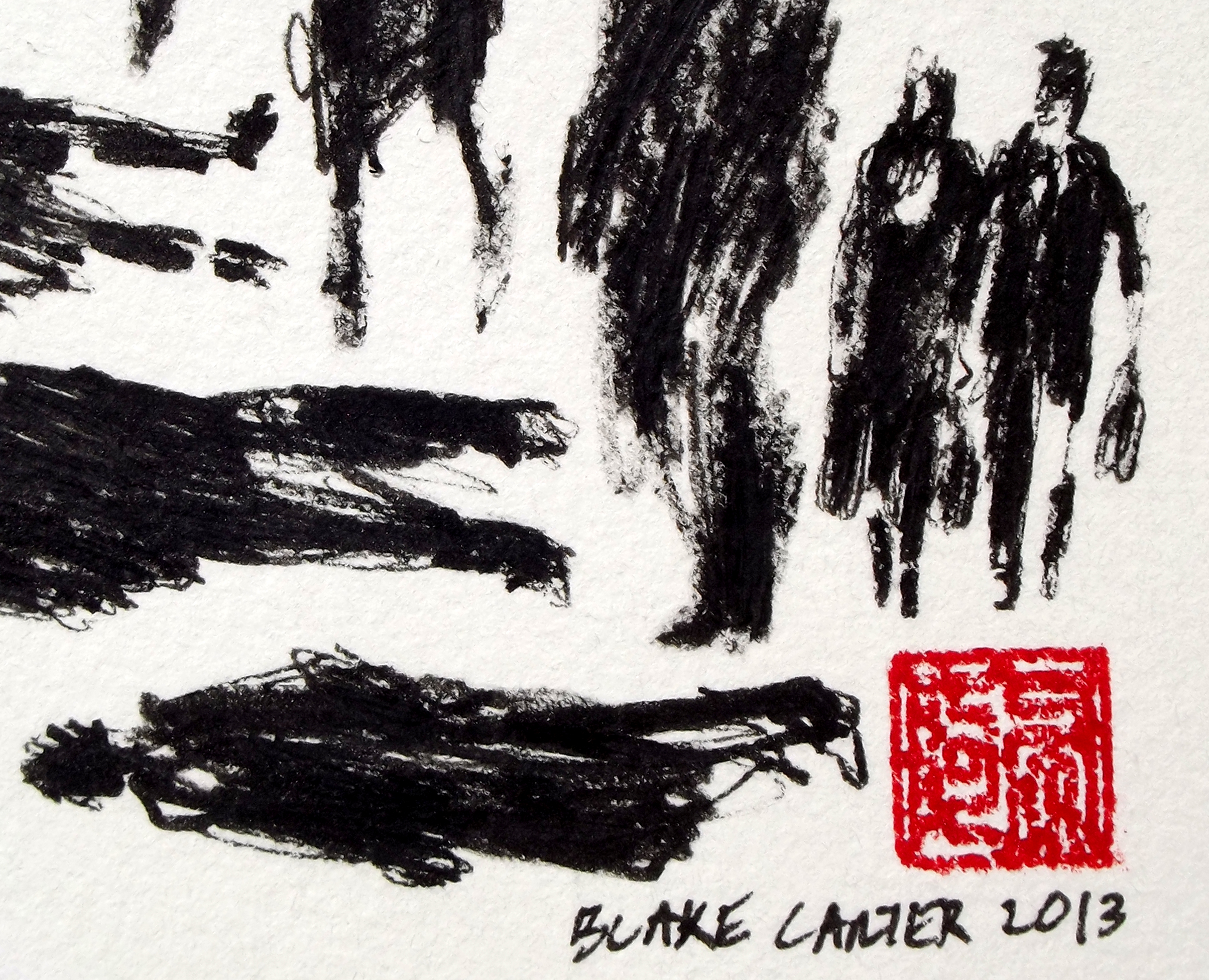
I’m particularly interested in this Fragonard painting right now because I’ve been working on a similar effect in my Pedestrian Series. I discussed the difficulty of photographing my work and the importance of viewing my work in person in an earlier post. Below is a detail from my last work of 2012:

Blake Carter, 335 Pedestrians (Skull) (Detail 1), 2012
Recently I decided to try something that I’ve been knocking around for a while. I’ve been drawing figures with Sakura Pigma pens and Faber-Castell PITT Artist pens for a few years and feel I have a bit of control with them, despite the fact my process is reliant on a lot of “happy accidents” that occur while I’m scribbling. In the detail above you can see the variety of marks I use.

Detail 2
From the little distance of the image above (detail appr 2×3 inches), it’s obvious the marks in my piece describe individual figures. There are parts with heavier marks, and parts with lighter marks.

Detail 3
Now you see what I’m getting at. By altering the weight of the marks in each figure, I can use the smaller figures to create a larger image.

Carter, 335 Pedestrians (Skull)
There’s the full piece, above. Nothing revolutionary. When I was in high school, the art teacher gridded out a Leibovitz picture of Jim Morrison and had her students each draw a small piece (maybe a foot square), then arranged them all and hung them in the lunchroom. Chuck Close also comes to mind, as well as every super-realist who talks about concentrating on the individual grids in an image and treating them as small, abstract paintings that add up to completed pieces resembling photographs.
It’s a simple idea, but it’s very important when looking at art, and paintings in particular. Any figurative or landscape piece can be broken up into an infinite number of smaller, abstract images. I’m currently reading a book about Alice Neel (Alice Neel: The Art of Not Sitting Pretty by Phoebe Hoban), who worked in New York in the middle of the last century, a time when critics and artists vigorously proclaimed allegiance to abstract versus figurative art.
They all seem a bit silly now. If I fail to see the figure of a woman in a painting from de Kooning’s Woman Series, is it abstract? What if I think Franz Kline’s work looks derivative of Chinese characters — does that make it more based in visual reality?
Filed under: 2012.NOVEMBER, SCRAPS | Tags: art, California art, calligraphy, chinese art, contemporary art, ink, women
 (Detail 1)")
Killer bees attack (column 12, row 2).
Above and below are details from 255 Pedestrians (and Stroller), completed late last night. As in most of my recent works, I’m playing around with ways to make marks using Sakura Pigma Graphic and Sakura Pigma Micron pens. I’ve also been trying to push myself to draw more women. For some reason Freudian or otherwise, I tend to enmasculate females when I’m drawing. I figure it’s something to do with mirrors. Regardless, I don’t often hear complaints that there are too many women around.
 (Detail 2)")
Shrunken-head Pablo (column 11, row 11).
 (Detail 3)")
Stretch pants (column 5, row 14).
 (Detail 4)")
This is one of my favorites from this piece. No pedestrian really, just scribbly swirls.
 (Detail 5)")
Some of these lines cut into the paper, so up close this almost looks like bas relief (column 6, row 8).
 (Detail 6)")
I wanted suggestion to play a big part in this drawing. Does this woman have feet? (column 1, row 2)
Eventually I’ll get an image of the final piece up on my gallery of finished works, for now it’s on my Facebook page.
Filed under: 2012.NOVEMBER, SCRAPS | Tags: art, art technique, calligraphy, China, chinese art, Chinese calligraphy, contemporary art, drawing, ink, modern art, scroll painting
")
In my previous post I noted how differently pieces from my Pedestrian Series look in real life and in photographs. Here are more close-ups, this time from 255 Pedestrians, a piece I finished yesterday. Watch the figure above as you scroll down. Starting with her, I zoom out to show the surrounding eight figures, then the sixteen figures surrounding those, and etc, up to the finished work.
")
")
")
")

Filed under: 2012.NOVEMBER, SCRAPS | Tags: art, art technique, California art, calligraphy, China, chinese art, contemporary art, ink, scroll painting
 (Detail)")
The above detail is about 2.5 inches across. One thing my ongoing show in Laguna has taught me is that my current works look much, much better in real life than they do in photographs or on a monitor. The most basic problem is that the plane of our eyes’ focus changes constantly, and this is impossible to achieve with a camera. Even line art on the slickest vellum looks much better to the eye than it ever could in print. In a previous post I noted how happy I was that a friend and collector chose to hang my work at the end of the entrance hallway of his house; the pride of place was flattering, but I also know that people entering his door will see my piece from a distance first, and then their focus will change as they approach the wall on which it’s hung.
Below are five works I’ve completed since sending pieces for my current show to the framer. I’ve been experimenting around with my Pedestrian Series:

Now here’s what I love most about this series. Each figure is composed of rough, abstract lines and forms that together add up to the images you see from a distance. In a photograph, these forms are only visible in a close-up view:
")
In these details, you can see how the ink is sometimes jammed down into the porous watercolor paper, while at other times the pen has been roughly slid along the surface, and still others, the ink sits atop the paper in a layer:
 (Detail)")
I’ve been playing around with introducing color into these works. Below is a detail of a piece that includes marks using Prismacolor Premier markers, but I’m not sure if I like the way the ink soaks into the paper so easily. You can tell the difference between the thick orange lines (Prismacolor) and the fine red lines (my usual Sakura pens) flaring out from the figures:
 (Detail)")
Here’s another experiment. For this piece I coated the paper with a layer of black acrylic paint, and then scraped the white forms out with an X-acto blade:
 (Detail)")
Another view of the same piece, showing how the individual images look up close and further away. Only with the naked eye can you see both views of the same image at the same time.
 (Detail II)")


My good friend Dana Jurika sent me these pics of him and friends acting goofy with one of my “Art Portraits.” This one’s Art Garfunkel. Thanks Dana.


Here are sketches I drew while spending time with my brother (who is cooking “three-cup chicken” above) in Huntington Beach.

This is a sketch for the drawing below. I’m trying out my new box of Prismacolor Premier Cool Grey markers. From a distance some of my scooter and pedestrian drawings just look like fields of little blips. Though I’ve nothing against little-blip fields, I thought I’d up the neat-grid-minimalist-versus-sloppy-sketch ante by giving them an Op Art look.

The outer ring of 364 Fading Pedestrians, which I drew with Sakura Pigma pens. Love those nibs.

The inner section of 364 Fading Pedestrians, probably around 50% Cool Grey with the Prismacolors.

A broader detail from 364 Fading Pedestrians, showing the fade from black to 90%, 80%, etc etc down to 10% Prismacolor Cool Grey. My brother says it looks like I spilled a glass of water on my drawing.

And at last, 364 Fading Pedestrians, leaned against a car in front of the house, before I erased the penciled grids I used to plan the work.
Filed under: 2012.OCTOBER, SCRAPS | Tags: commissions, scooter art, Scooters


Just received these pictures courtesy of John Borland, who commissioned me to make this piece (489 Scooters, 2012) a couple of months ago. We planned the work for a wall space at the top of a staircase in the back of the house, but after receiving it he decided to hang it at the end of the entry hall — first thing you see when you come in the front door! He even hired a child model for the unveiling. Great to see my artwork find a good home.
