
Filed under: Uncategorized | Tags: art, art process, contemporary art, drawing, inkonpaper, sketchbook
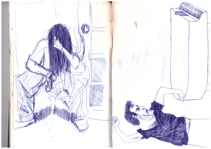
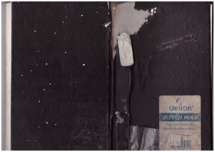 My brother Scott visited from Long Beach, California, and he brought me this water-damaged sketchbook from more than 20 years ago. I thought my old drawings might be kind of embarrassing. Scott’s an artist, he’s smart, and he thinks a lot. He suggested that it would be less important to me how the drawings looked, and more important remembering where I was when I drew the sketches. He’s often full of wisdom like that.
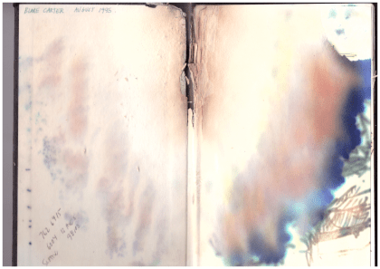
Scott was right. The drawings were better than I’d thought they would be, but the trip down memory lane was even better. I finished college in 1994, and this sketchbook is from the year after. I’d just moved into my first apartment ever in Georgetown, south Seattle, and had a painting studio down the street that I shared with Scott. The place I lived in wasn’t so nice. I came home once to find a neighbor passed out on the stairs with a 2×4 in one hand and a case of Schmidt Ice in the other. A visiting girlfriend discovered that someone pooped in the communal shower. There was screaming and ambulances, and there was a mouse that lived in my stove. The opening page of the sketchbook reads “August 1995,” and towards the end of the book there’s a drawing dated November 1996.
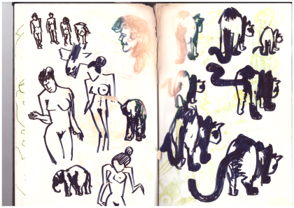
The drawings aren’t bad like I’d feared. This one on the right, like a lot of them, was based on art I saw in a magazine or book. I think the cats are from a Japanese ink painting I saw somewhere. The figures on the left remind me that I was reading Norman Mailer’s “Portrait of Picasso as a Young Man,” published that year.
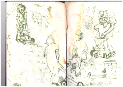
I drew these in the yard of my parent’s house in Gig Harbor, Washington. That’s Scott mowing the lawn. I was interested in blind line-drawings at the time, kind of makes everything look a bit cubist.
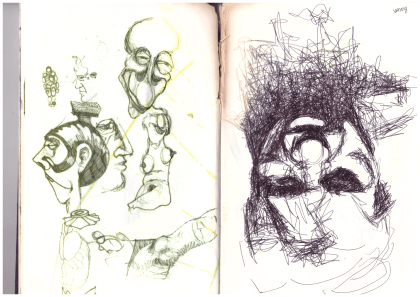
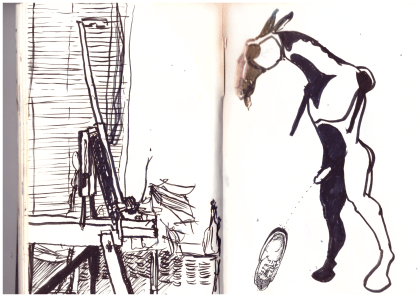
I was totally fascinated with Francis Bacon, still am. He’d just died a few years before. Interesting how differently the inks on the left and right pages held up. These days I try to only use art materials that promise to be “archival quality.”
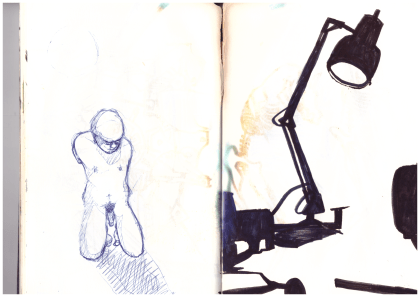
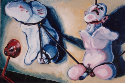
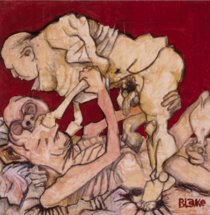
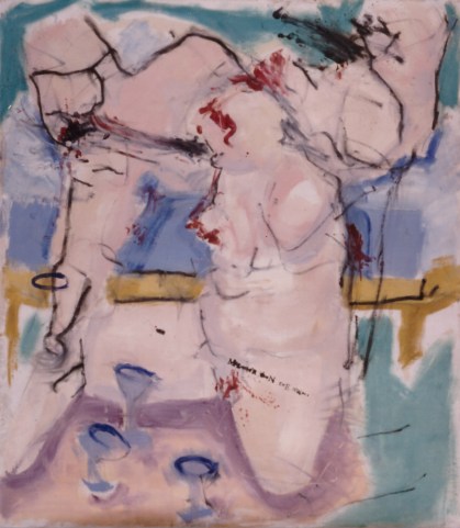
The studies above became part of my first oil painting. I’d painted with oils before, but just student work and none of it was very good. This one turned out well, I think. Friends teased me about the subject matter. I wanted something that would catch attention.
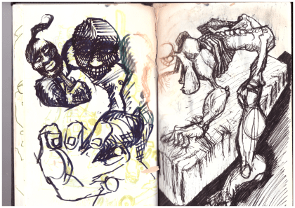
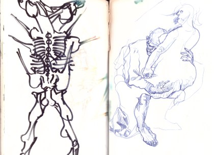
The drawing to the right, above, also became part of a painting. I drew people as structures, like buildings or machines. Line quality and shapes meant more than the figures I was piecing together. You can tell I was looking at Picasso. The painting is acrylic on a failed oil painting. It’s now rolled up under my bed, falling to pieces.
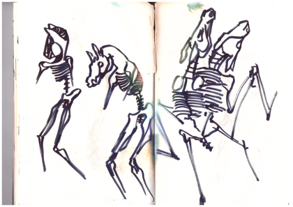
Always fascinated by skeletons. Not sure where I was going with the horse sex thing, but there are a few in this sketchbook. The horse skull later made an appearance in my favorite oil painting from this time. I still have my paintings from this period, but they’re in bad disrepair because I painted on top of old paintings. Someone told me it didn’t matter, I just had to keep painting. It sounded good because I didn’t have money for new canvas every time I didn’t like a painting, but it was a mistake.
More horse sex, and a copy of Otto Dix from a book.
I think I thought there was something sexy about horse legs. For the record, I’ve never purposely peed on a shoe.
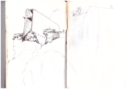
Saw this chapel on a family vacation, maybe in Utah.
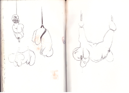
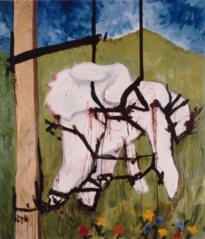
I got interested in things hanging by leather straps. Not really personally interested, but I thought it looked good. The above sketch turned into my largest painting to date. The painting contains a literary joke: “The grass is always greener” on the left side of the post.
I got pretty excited about jokes in paintings at the time. Friends had been teasing me about how I always had penises in my paintings, so in this one I didn’t paint the penis, but instead there’s text that reads “The … mightier than the sword,” leaving out the words “pen is” right where the missing penis would be. Brilliant! No one ever thinks it’s as funny as I do.
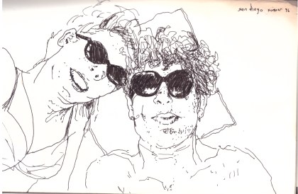
Here’s one of my best memories to date, toward the end of the sketchbook. Me and my girlfriend at the time went camping together on the Baja Peninsula. We’d realized we weren’t perfect for each other, but decided to have a last hoo-rah trip anyway. I saw her once again after that, in Southeast Asia. It’s been almost twenty years since we said goodbye in Hoi An, Vietnam.
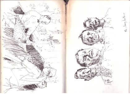
I’m not sure whether this one on the left is based on a picture or something I just did freehand. Either way, I definitely had more patience than I do now. On the right the Clancy Brothers, from a photograph.
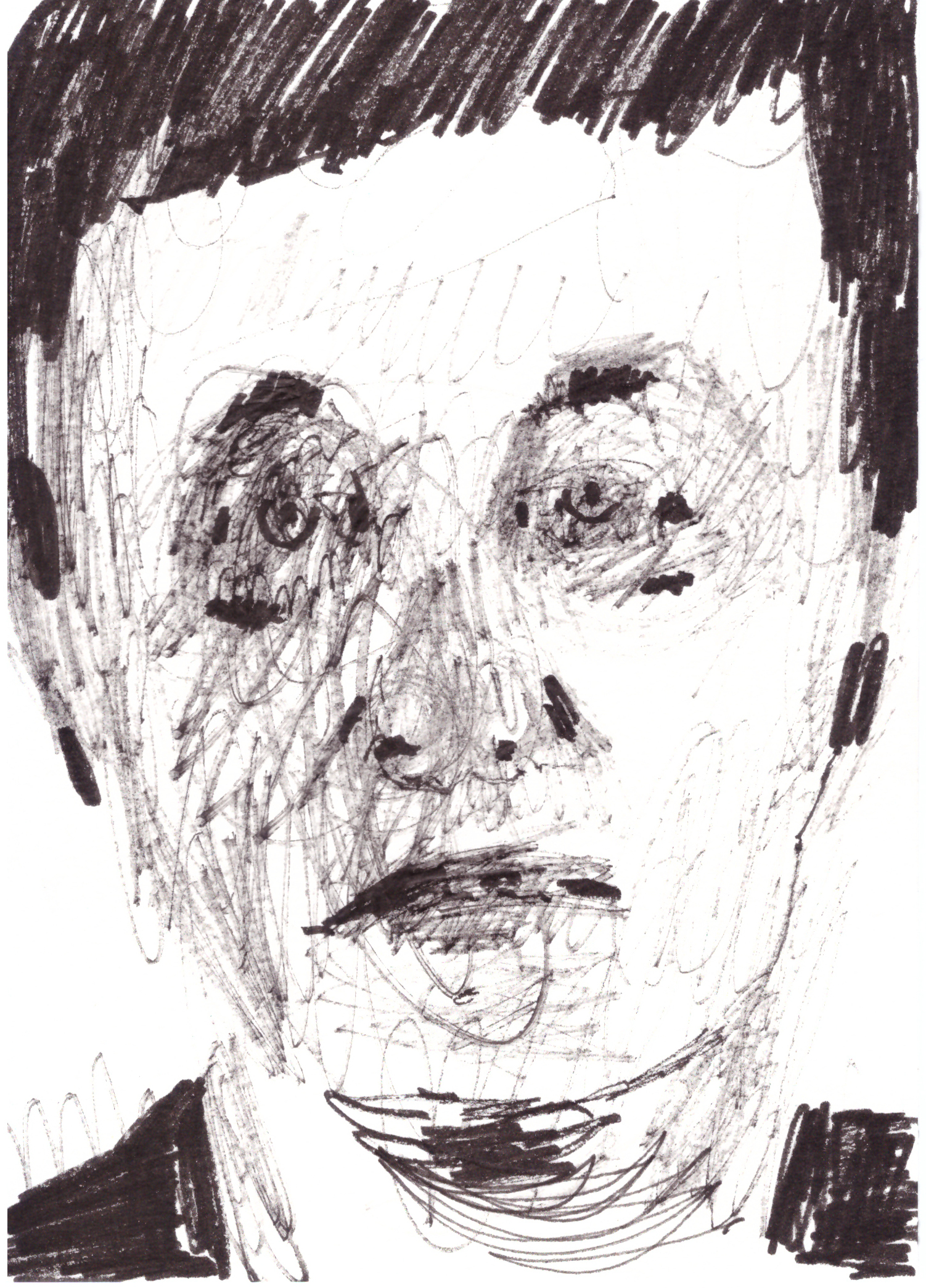
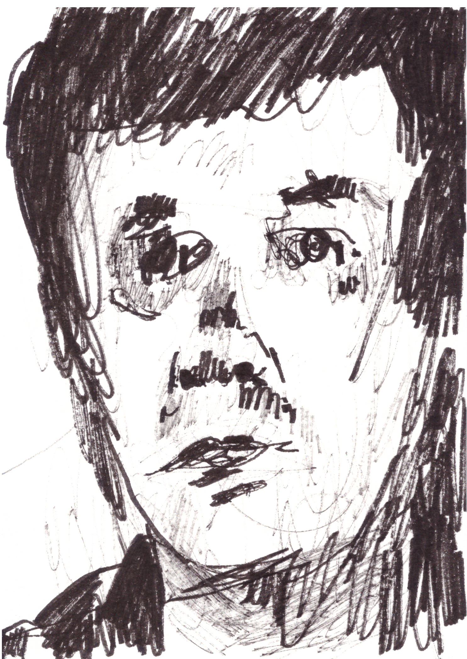
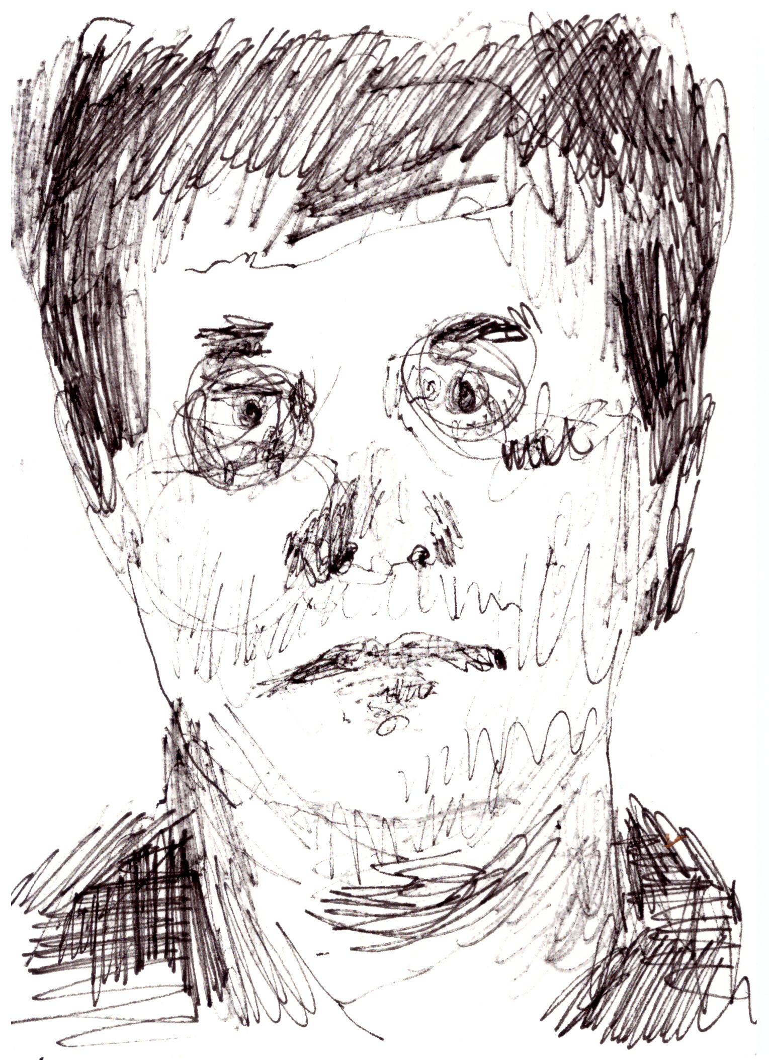
It’s weird looking at these drawings from so long ago. They’re mine, but for the most part, I don’t remember drawing them. It reminds me that I can be a different person in different contexts. I recently heard an NPR podcast about the fallacy that people are born and live with a certain personality. You’d assume that it was a thread you could follow through someone’s life, but really, people adapt to the situations they experience.
This old sketchbook is from 1995, when I was 23 years old. I turned 45 this October. My “art career” hasn’t really taken off (yet). I kind of put art in the back of my mind in my late 20s, and though I never stopped sketching and thinking about art, there was a gap of ten or so years when I didn’t push myself to make finished pieces I was proud of. I thought I’d never be able to make money from art, so I concentrated on other things. I came back to it about ten years ago. While working for a newspaper in Taiwan and interviewing artists for articles about their shows, I realized that I liked making art better than anything I’d done to pay bills or have health insurance or all that. So now I have a day job delivering beer that gives me three-day weekends, but really I’m an artist, and I’m happier with my artwork than I’ve ever been.
One of my favorite parts of ArtForum Magazine is the “Passages” section, which highlights artists who have recently died. Instead of the typical lifeless obituary, “Passages” includes current interviews and essays with and by living artists, friends and critics, often written rather casually.
For me, the subjects of “Passages” have two things going for them that make them stand out from most of the other artists featured in the magazine: (1) They’ve just died, so they probably produced their best-known work during my lifetime; and (2) They’re famous enough to have been selected for the column, meaning I’m probably familiar with their work.
A few weeks ago I opened the September issue of ArtForum and learned that Chris Burden had passed away in May. The magazine featured excellent, touching essays by several artists, including Vito Acconci. Burden was 69 and died of cancer, if that matters. His death doesn’t change what I’m going to try to do here: Explain why I’ve always felt an affinity with Burden, who I didn’t know, never met, and can’t even say I’m terribly familiar with.
I first learned of Burden while at Whitman College through Dennis Crockett, who was such a good art history professor that it doesn’t seem right to describe him as just “an art history professor.” When Dennis spoke in class, I felt like he was talking to me only. When he described trends in the art world, it seemed like he was re-writing my childhood so that anything I did afterwards was informed by all that came before. My floating head grew a neck, shoulders, arms, torso and legs, and then my feet reached the ground. Sounds rich, but that’s how I felt.
At the time I was probably nineteen or twenty years old, and I still thought that art was about colors and perspective and prettiness.
Chris Burden’s most famous work, and the first one I remember learning of, is called “Shoot.” In front of a small audience, he walked to one end of a gallery and held out his left arm. Another man stood sixteen feet away, raised a .22 rifle, and shot him in the arm. End of performance. Burden went to a hospital.
For another piece, Burden lay back atop a Volkswagen Beetle and an assistant nailed his hands to the roof of the car. The car was rolled out of a garage with Burden “crucified” on top, revved up for two minutes, and rolled back in the garage.
So that’s art, I wondered, and so is the Impressionist boat painting in the dentist’s office? I never questioned whether Burden was creating “art.” I just tried to reconcile his work with my own narrow experience of drawing, painting and sculpture. Maybe the idea that art meant bringing something new into the world could be applied to concepts, and there wasn’t any need for material proof that they ever even happened. But where do you go from there? I still don’t know.
That’s kind of a lie. The “Where Do We Go?” question is addressed in anything that anyone makes after they know of artists like Chris Burden. Art wasn’t just torn up and thrown out the window, it was just more informed.
There’s a kind of an answer in Burden’s later work. The performances I described above took place in the 1970s, about twenty years before I “discovered” them in college. Much of his later work explored scale and juxtaposition. Here are a few pieces I know of, in order of whatever I think of, and as inaccurate as I remember them:
- Burden raised money and placed silly TV ads. Some of them are painfully awkward, but Burden doesn’t care! Then there’s one that’s absolutely brilliant. I think I heard about it from Dennis Crockett two decades before I actually saw it on YouTube. It’s just text with a narrator reading out names: “Leonardo da Vinci … Michelangelo … Rembrandt … Vincent Van Gogh … Pablo Picasso … Chris Burden.” It was played as an ad during Saturday Night Live. Ha! Brilliant! (See Burden’s video ads here.)
- He built a giant Erector Set building, like as large as a real building.
- He made a piece called “You’ll Never See My Face in Kansas City,” where he just sat in Kansas City for a while, wearing a balaclava. No one could see his face! The man was a genius. Now think back to when he got shot in the arm: Title of that piece? “Shoot.” Effin’ hilarious!
- He built a giant vertical wheel, huge, out of concrete, so big that they had to cut out part of the gallery’s ceiling or floor for it to fit in. Then he backed a motorcycle up to it, and started it spinning, so when you see it you know it could totally wreck the gallery and kill everyone if it slipped off its axle.
- He made a giant slot car track that’s at the Los Angeles County Museum. I thought this one sounded dumb, but had a bit of an art experience when I saw it for real. I like art that makes you ask “Why?” Nobody asks why someone paints a pretty picture, but why did Burden take toys so seriously, or did he take them seriously? There’s a lot of Sisyphus, but it seems so brash and boastful that it’s like he enjoys the uphill part. Enjoy the uphill part: That’s a Burden lesson.
Another important thing about Burden is that he didn’t look like he was out to educate people. He just po-facedly said and did what he was going to do. You’ll cringe if you watch the videos I linked to above. He was a normal, kind of creepy-looking dude. There’s no sense of glamour, though to me he aimed high and challenged us to rise up to his smart, serious, humorous take on what art is, and what is important about new things.
I hope I absorbed some of what Chris Burden had to say, and I wish more people would pay more attention to new ideas in the art world. I mean just all of us. There’s something there that’s bigger than the world as we know it. I was lucky to have such an enthusiastic introduction in college. Everyone knows what happened art-wise in early 20th century France, maybe even what happened in New York half-way through the 20th century. After that it gets jumbled because it’s relatively recent, but it’s just as important to our collective thought. I know Chris Burden isn’t “new” – Hell he’s dead since May and didn’t die young – but I changed because of his work.
That’s the best thing I can say about an artist: I think differently because of Chris Burden. I suspect everyone does, even when we don’t know it.
Filed under: GICKERS | Tags: abstract expressionism, Blake Carter, clyfford still, colorado art, contemporary art, denver art, denver museums, still museum
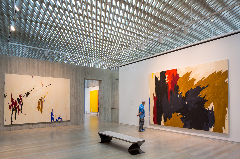
The final gallery in the Clyfford Still Museum, Denver. Photo by James Florio, courtesy of the museum.
It’s rare to see a significant portion of an important artist’s oeuvre in a single exhibition, or even in a single museum. By the time artists become established, most of their work is dispersed in museums and private collections, making it extremely difficult to organize a thorough retrospective. The best an ardent fan can do is to visit a few exhibitions featuring works by a favored artist, and to view a published version of the artist’s catalogue raisonné.
My recent experience at the Clyfford Still Museum in Denver called my attention to the importance of considering artists based on the entirety of their work, not just a few well-known pieces. Of course it’s never possible to see every single piece by a particular artist, but many major retrospectives and single-artist museums select as many “representative” pieces as possible, aiming to show viewers the full trajectory of the featured artist’s career. The Still Museum does a great job of doing just that.
Clyfford Still is the perfect feral child for such an endeavor. Rather than relying on art sales, he earned most of his money from teaching, hoarding the bulk of his work. According to museum literature:
In 1951, Clyfford Still ended his relationship with the prestigious Betty Parsons Gallery in New York. From that time forward [until his death in 1980], only a very select few of his works entered the art market. As a result, the Clyfford Still Museum now houses 95 percent of the artist’s total output, making its collection the most intact body of work of any major artist.
The museum’s collection boasts around 825 paintings and more than 2,300 works on paper, with 375 paintings from 1961 to 1979, “most of which have never been exhibited.” Artists of Still’s generation took Art with a capital “A” very seriously, and Still was very particular about where or whether his work could be exhibited. His will stipulated that his remaining body of work not be split between several institutions, that it not be exhibited next to works by other artists, and that it be kept in an American city “in perpetuity for exhibition and study.”
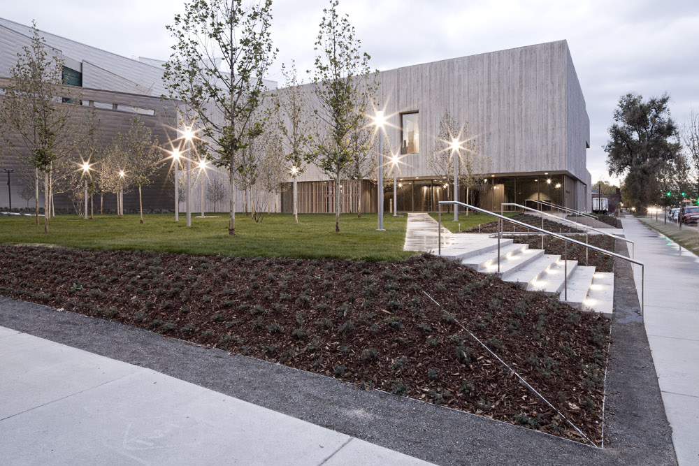
Outside the Clyfford Still Museum in Denver. Photo by Jeremy Bittermann, courtesy CSM.
After Still’s death, the works weren’t available to the public for more than two decades while his wife Patricia found and negotiated terms for a permanent space. She eventually chose Denver as the home for the collection, and the Clyfford Still Museum opened in 2011, more than 30 years after the artist died.
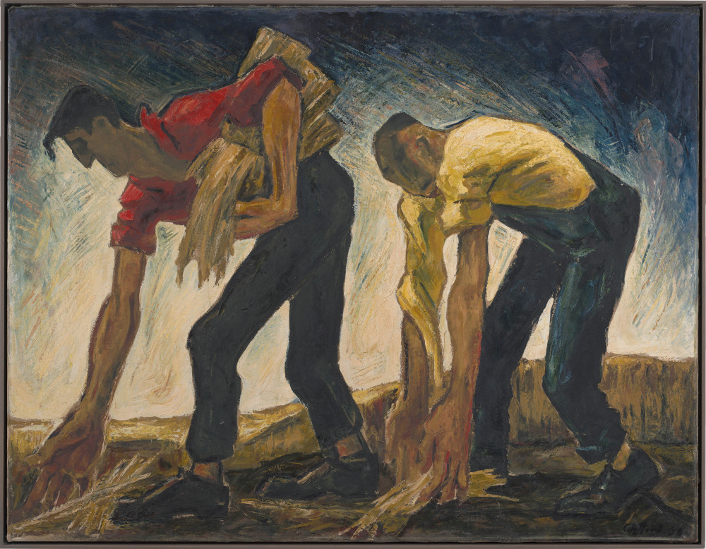
Last month (in February 2015) I had a chance to visit the museum for the first time. Still’s early works are reminiscent of other painters of the first half of the 20th century: Several echo Thomas Hart Benton, there’s a bit of Edward Hopper, and there was even a piece featuring drooping faces that was reminiscent of Salvador Dali’s “Persistence of Memory.” I’m not saying that Still was copying from other artists, but that to my eye, 80 or 90 years later, his early works don’t look distinct from others of that era.
This work, dated 1936, features angular lines foreshadowing those in Still’s later abstract paintings. Photo by Gary Regester, courtesy CSM.
The museum is arranged chronologically. After the first gallery of technically proficient but unexciting earlier work, visitors turn a corner into the second gallery, which contains figural paintings that Still created mostly in the 1930s. On their own, these pieces would also be unexciting to me, but I immediately recognized the mostly vertical, lightning-shaped lines that Still became famous for in his later abstract works. As the gallery progressed, the earthy, long-limbed figures became more and more abstract, and at the end, Still had realized that the line and shapes and composition were more interesting than the socialist-baggage-laden tillers and planters and mopers he’d been painting. Bam! Still was plowing new ground as one of the first Abstract Expressionists, exploring topics that were bigger than ordinary life. He’s now considered a founder of the movement, along with Mark Rothko and Jackson Pollock.
As I walked into the gallery displaying Still’s earliest abstract paintings, I saw a child run up to his father and ask, “Dad, do you know what this painting is of?” The father said something about the line being interesting and asked his child whether the shapes were interesting. The kid ran off.
To me, after seeing his earlier work and reading a bit about Still and his grandiose ideas about abstract art, these paintings were meant to capture and represent Truths that transcend what we normally focus on. He wanted to show that there were repetitive patterns under everything, and that those patterns could and should be seen and explored. The term “mystic” often pops up in talk about Still and contemporaries like Rothko. I wonder whether Still would respect other people seeing different patterns and exploring them, or whether he would insist that he had found the “real” patterns.
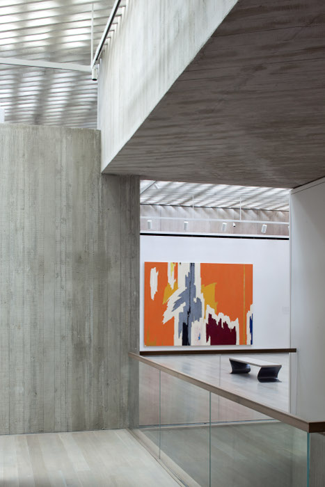
No “orange is the new” jokes please, this is serious Art. Photo by Bittermann, courtesy CSM.
The last two galleries in the museum showed the culmination of Still’s explorations of patterns that he’d gradually gleaned over years of looking at and thinking about the world. The paintings are large, mostly at least 10 feet by 10 feet, and some much larger. They represent his mature work as known to me and the rest of the general public. He’s been noted for his role as a “visionary loner” by the no-holds-barred art critic Robert Hughes:
All dialogue with other art, indeed all exchange with the culture around him, had stopped long before, and he was frozen by his own sense of grandiose outsidership in an art world whose corruptions he loudly despised – but which he skillfully manipulated himself …”
I walked into the Clyfford Still Museum not expecting to be impressed, but I thought it was my duty to visit, especially as the bulk of his work will never be exhibited outside of Denver. Before visiting the museum, I wasn’t a fan of his vertical, crunchy abstractions, and I certainly wasn’t a fan of him telling everyone what art should be about. I changed my mind though, and by the time I reached the final couple galleries of his larger pieces, I felt like a fan. I noticed forms he stuck with and explored over several paintings or even several decades, and I appreciated the experimental features in paintings that I may have previously thought were all overly similar.
I don’t think any of Clyfford Still’s paintings will ever be among my favorite images from mid-20th century art, but I admire him for his perseverance and insistence on us viewing his work in the context of his own work. I’m not sure if he was a genius or a grump or both, but it works at the museum in Denver. For me, visiting the Still Museum felt like a step into the artist’s mind. He didn’t consider other artists his equal, and insisted we view his work in that context. As far as I can recall from what I’ve read, Still worked hard and paid his bills by teaching, keeping his best art to himself. His insistence on not showing his paintings in the context of other artists worked, and it’s great to see that his wife found enough donors to create a museum that features most of his work.
I learned a lot more about Clyfford Still by seeing his works together than I ever would have if I’d seen them surrounded by the work of his peers or historical bookends.
Who doesn’t enjoy their behind getting felt? Photo courtesy CSM.
I visited the museum with my aunt Jon and my cousin Ed. We stopped by around noon on Superbowl Sunday and had some of the galleries to ourselves. I was impressed with the chronological layout and succinct descriptions of Still’s career, and I think my companions were too. We were all impressed with the bench seats, which were made of simple, two-inch-thick pieces of gray felt. An activity room seemed to keep children entertained, and the Clyfford Still jigsaw puzzle there kept us entertained for a few minutes. As noted by another blogger before the puzzle was available, it was “being produced by hand locally, in a very low volume, and will be sold only at the shop.” It’s there now and available for $275.

The limited availability of the Still jigsaw puzzle matches the spirit of the artist’s will. Photo courtesy CSM.
Too bad not all artists are as strong-minded as Clyfford Still. Or maybe not. One Clyfford Still is probably enough, and he did a good job of it. It could be a remnant from another era, but I can’t shake the belief that art should be unique, and I respect artists whose work is distinctive, more than any other quality. Perhaps it’s the result of the fact that I was a child of Modernism, at least in my mind. That’s what I thought I was up against in college, when I had my first hint of being an artist in the context of other artists.
I think that uniqueness is still the most overlooked quality in contemporary art. Historically, art may be well past that stage and back again several times over, joking about the effort to be original instead of truly striving to create something new, but I’m still impressed with pioneers like Clyfford Still.
Filed under: SCRAPS | Tags: because america, Blake Carter, chinese characters, contemporary art, contemporary drawing, ink drawing, northwest art, seattle art, tacoma art, wood panel
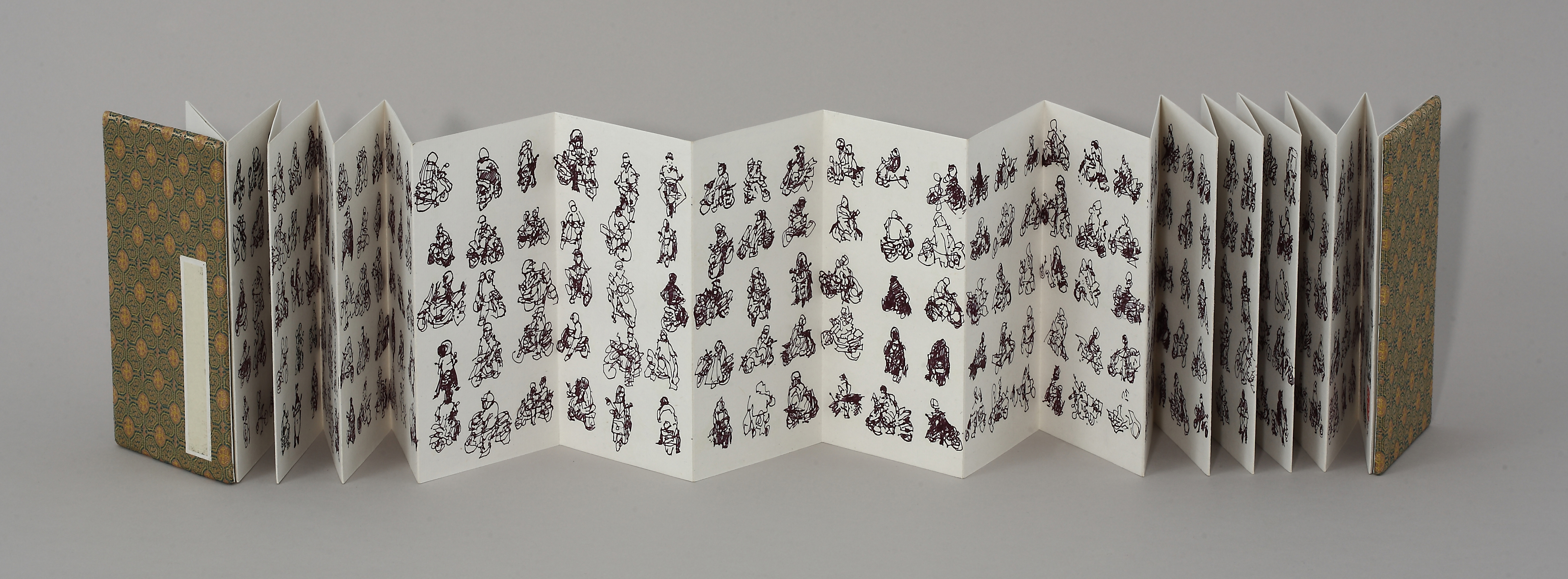
The first completed piece in my Scooter Series, drawn en plein air at Taipei intersections in 2009.
I’ve spent about half of my life outside the US, my home country. My father was in the Air Force, and while I was growing up we lived on and off military bases in Taiwan, Japan and Germany. After attending junior high, high school, and college in the US, I got itchy feet, and spent 11 of the next 15 years living and traveling in Southeast and East Asia.
I returned to the States three years ago. I’ve posted before about my Pedestrian Series, which grew out of my Scooter Series, a project that ended soon after I found myself in this land bereft of Yamaha Super Fuzzys and other stars of the Taiwanese intersection.
My latest Pedestrian Series piece, 1,040 Americans, is a tribute to America and Americans, the greatest people ever to insist on the name of an entire continent as their moniker. Watch, learn, and enjoy.
Filed under: SHOWTIME | Tags: art exhibitions, art installation, art process, frames, framing, how to
 I recently had 10 small drawings on watercolor paper (12×6 inches) framed at Michaels, which quoted the project at $350 less than my local frame shop. Here’s a list of things I wish I’d asked them at the beginning, all of which I wish they’d asked me or just done based on me telling them the pieces were for an exhibition:
1. Insist on wire, not saw-tooth hangers.
I’ve never used saw-tooth hangers, but I’ve read they make it difficult to hang artwork precisely. I’ve also entered exhibitions that required wire, and specifically stated “no saw-tooth hangers.” I had to ask the poor Michaels employees to remove the saw-tooth hangers and add wire.
2. Inquire about the paper color of the backing.
Michaels used a powdery blue that I wasn’t fond of, but it’s the back of the piece, so I didn’t mention it.
3. Ask the framers not to add cheesy gold Michaels stickers to the backing.
When I asked the framers to change the saw-tooth clips, I said I didn’t like the stickers, and ended up getting some with stickers and some without. Again, this was the back of the pieces, so I didn’t make a fuss.
4. Ask the framers to be careful that they don’t leave clear plastic “photo corners” hanging out of the mat corners.
This one should be obvious. After having the framers at Michaels re-do the hangers, I returned to find four of 10 pieces with clear plastic photo corners showing in the front corners of the art. They were small, but they glimmered. There were also black and brown particles in some of the pieces. I asked that they be redone.
5. Tell the framers you’re going to carefully inspect the fronts of each and every piece for particles, and ask them to do the same.
I called Michaels before returning for the third time, and asked an employee to unwrap the pieces, inspect them, and call me when they were definitely ready. I got the call, returned and found that one of the matte corners was torn and two pieces had obvious particles in them. The employees were apologetic as always and said that they would re-order the torn matte from their matte-cutter in California, and would do their best to remove the particles from the two other pieces.
On my fourth return visit to Michaels, only one piece had an obvious brown particle in one corner, and a tiny bit of plastic photo corner showing through. I asked that it be redone. When I returned a week later it hadn’t been done, but a very friendly employee let me watch and help, and I left very happy that I’d stayed in budget and was satisfied with all 10 pieces.
6. If you’re planning to hang more than one piece of equal size on the same wall, request that the framers place the wire hangers at the same height for all the pieces.
This is another one I didn’t think I would have had to specify. On my final visit to the Michaels frame department (ever), I noticed that the wire hanger on my 10th piece looked a little high compared to the nine others I’d already taken home. When asked how the wire hangers were placed, the framer replied “about two-thirds up.”
As it turns out, “about two-thirds up” means the hangers on my 10 pieces vary from 10 1/8 inches from the bottom of the pieces to 11 ¾ inches from the bottom, despite the fact the artwork and frames were all the same size. If the wires were at the same height, I could figure out the ideal viewing placement of the pieces and drill 10 holes at that height on the gallery wall. Instead, I’ve had to measure where Michaels placed the wire and calculate each of the 10 hanging heights individually. During installation, if I hang my pieces and want to switch one for another, I have to drill another hole up to 1 5/8 inches above or below the existing hole.
All said, the $350 I saved by working with Michaels could buy a lot of aspirin, and I did end up with 10 framed pieces that look great. I’m not going to specify the particular Michaels location I visited here, but I will if anyone contacts me privately. I realize that a lot depends on who’s behind the counter when you arrive, and who does the work.
The quick answer to custom-framing problems would be planning my artwork in ready-made frame sizes, but I’m impulsive when I make art and I wanted these pieces to be disproportionally more vertical than standard frame sizes. The better solution would be buying the equipment to frame my pieces myself, but I looked into it after calling Michaels and it wouldn’t have saved me money in the short-run, and would have taken much more time and workspace than I have.
I’ve also been thinking outside-of-the-box on presentation and media, and have started experimenting with drawings on wood and canvas, both much easier to display than paper. For my current show, I’m sandwiching my larger paper pieces between glass and matboard, which looks great and eliminates the need for frames.
Any comments or tips on displaying drawings without paying hundreds for each piece?
Filed under: GICKERS, Uncategorized | Tags: architecture, art books, artist biographies, book reviews, frank lloyd wright, literature
As I’ve noted previously in this blog, I love art biographies. While an undergraduate art student, I memorized a few dates, locations, and names of buildings designed by Frank Lloyd Wright, but never knew much about him, so I recently read Meryle Secrest’s Frank Lloyd Wright: A Biography.
Based on Secrest’s account, I now picture FLW as an intolerant, delusional a**hole who thought his artistic talents an excuse for abhorrent treatment of friends, family, and business partners. Strangely though, the a**hole became slightly more loveable as I finished the book. I admired his vision and stalwartness (is that a word?), but find it hard to imagine a person so oblivious to others.
I often fold down the corners of book pages when I read something that I may want to reference again. Here’s what I bookmarked in Secrest’s FLW biography (page numbers are based on the 1992 University of Chicago Press paperback edition):

Page 114: Writing about the “American house” around the turn of the century (19th to 20th), Secrest quotes FLW as saying, “It was vulgar, wickedly extravagant, a national waste, ‘a moral, social, aesthetic excrement.’” Later in the paragraph Secrest writes that the first argument between FLW and his first wife Kitty came “as she objected to his plans to inscribe ‘mottoes’ around their house, and he just as heatedly insisted. What he wanted were daily exhortations, reminders of right matters, right morals, right reflections upon the nature of things. Despite her, he managed to have ‘Truth Is Life!’ carved over the fireplace of their first living room.”
I’m not sure if I folded this page because of the wonderful phrase “moral, social, aesthetic excrement,” or because FLW would say such things and then insist on emblazoning his home with cheesy inspirational sayings.
Page 186: “For Americans oriented toward the Arts and Crafts Movement, Japan offered ‘the example of an indigenous culture that embodied the organic quality they found in the middle ages,’ as Richard Guy Wilson wrote.”
Yes Secrest is quoting Wilson, but I’m collecting sentences by writers who may or may not realize their verbage makes me snicker, and the “oriented toward … Japan” is a good one.
Page 429: “[FLW] would argue a point vehemently until she [his third wife], to end the fight, would drop her opposition. Sometime later, having changed his mind, he would chastise her for having allowed him to make such a fool of himself.”
I think I folded down this page because this seemed like typical a**hole behavior that I can regretfully see myself having been guilty of, but that I hope I’ve removed from my repertoire. Secrest writes like a psychoanalyst, and this is a good example of what she does well.
That’s it! There were a few other folded-down pages that left me wondering why they were folded down, or couldn’t sum them up in this blog post. I finished the book a couple of months ago and was happy I did. Secrest writes pretty well, but not so well that you’d read the book if you weren’t interested in the subject. Sorry Secrest, but I’m comparing you to my favorites like Borges, who could write about the hair growing out of his nose and I’d be thrilled.
Anyone else read Secrest’s FLW book?
Filed under: 2014.JANUARY, GICKERS | Tags: abstract art, bacon, Blake Carter, de kooning, figure, hirshhorn, museums, paintings, pollock
Sometimes I’m happiest when I change my mind. I treated everyday driving like a sport when I was a teenager, I didn’t like spinach or asparagus until my 30s, and I only recently admitted to myself that I enjoy listening to U2. I suppose it’s just maturing, but I like to think of it as a willful broadening of the mind. I try to suspend judgment and see things more objectively.
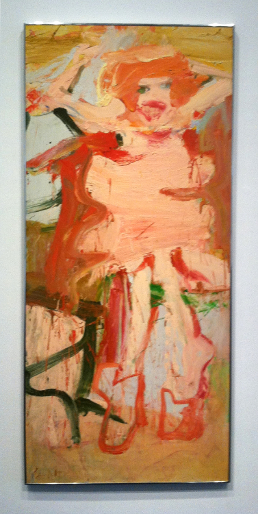
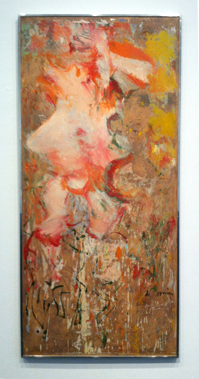
Willem de Kooning, Woman, 1965
Like responsible driving and vegetables, Willem de Kooning somehow got filed under “dull establishment drivel” when I first saw images of his work. It’s hard to imagine the me that overlooked his paintings as an art major. There was a bit of a spark when I saw slides of de Kooning’s Woman series, but I let it die out. I found Jackson Pollock edgier, and I preferred the contemporary scenery in Francis Bacon’s paintings to de Kooning’s experiments melding the figural with the abstract.
Willem de Kooning, Woman, 1964
Last summer’s trip to the Hirshhorn Museum in Washington, DC confirmed the folly of my youth. I now know that de Kooning could have painted as realistically as he wanted, and I don’t see his work as sloppy or contrived, which I guess is what I thought when I first encountered them. Now when pigment hits substrate, I appreciate a painting about pigment hitting substrate.
I like painters who balance the physical aspects of placing pigment on substrate with allusions to form we see in the everyday world. I enjoy finding the fulcrum, and I respect artists whose work makes me question where the fulcrum lies.
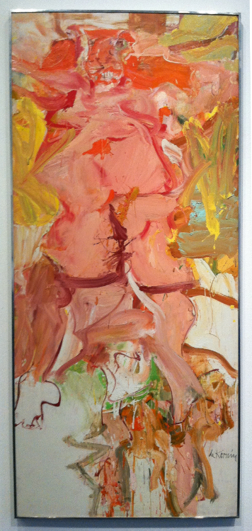
Willem de Kooning, Woman, 1964
Willem de Kooning’s Woman Series does this for me, and seeing several pieces in the same gallery at the Hirshhorn challenged me to compare my idea of form vs abstraction to his. We can’t all visit Washington, DC when we want to, but looking at these pictures took me back to my experience there. I wonder what de Kooning saw when he finished these paintings, and how it relates to what we see now. This series has been called angry, elegant, playful, intellectual – even misogynistic.
What do you see when you look at these images?
Filed under: 2013.DECEMBER, GICKERS | Tags: art biographies, art bios, art books, artist biographies, artist books, Blake Carter, Fischl, Kusuma, Wojnarowicz
Artist biographies are my Oprah. They inspire me, they arm me with art-world anecdotes that guarantee I’m the life of the party, and they have just enough educational value to make them guilt-free.
I don’t live in New York and I have minimal contact with “the art world,” so I especially enjoy detailed accounts of the lives of contemporary artists. I want to know what they eat for breakfast, who they date, and how they spend their free time. During the several years I spent writing about contemporary Taiwanese art for the Taipei Times newspaper, I tried to present the artists I interviewed as real people, rather than only focusing on their work. Of course the work is important, and I’m equally interested in process, studio practice, influences, and to some extent theory, but the story-lover in me can’t resist a well-rounded character.
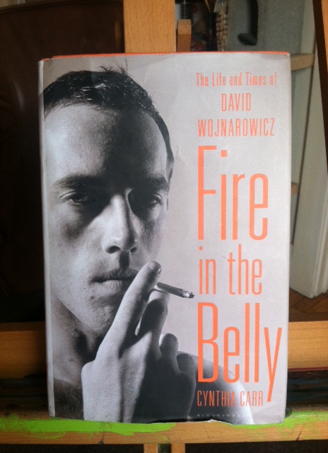
Imagine how pleased I was to find three newish books about contemporary artists on Amazon: Fire in the Belly: The Life and Times of David Wojnarowicz by Cynthia Carr (2012), Infinity Net: The Autobiography of Yayoi Kusuma (translated by Ralph McCarthy, English version 2011), and Bad Boy: My Life on and off the Canvas by Eric Fischl and Michael Stone (2012).
If you’re looking for something well-written, start with Kusuma, hold your breath through Fischl, and roll your eyes at Wojnarowicz. (Hire more editors, folks.) If you’re looking for content, I’d recommend Wojnarowicz first, then Kusuma, and Fischl last.
Wojnarowicz (“pronounced Voyna-ROW-vich” we’re told in the introduction) describes a terribly frightening period in modern history. It’s hard slash impossible for twenty-first century us to imagine a time when frequent, unprotected sex with strangers didn’t obviously lead to slow, painful death, and Carr conveys this very well. Spoiler alert: Everyone dies of AIDS. They die and everyone knows they’re dying because they get sores on their faces and become bed-ridden and helpless and obnoxious. Carr presents death and Wojnarowicz in a straight-forward way that made me feel I was learning about both.
I wasn’t very familiar with Wojnarowicz’s art when I began the book, though I was familiar with the 80s art market from books like Phoebe Hoban’s Basquiat: A Quick Killing in the Art Market. Basquiat and Wojnarowicz rose to fame quickly, sparkled, and died. They shared a confidence in their work that allowed them to get a lot done in a short amount of time; I suppose that’s part of the graffiti background. It’s hard to imagine either of them staring at a blank canvas for very long. Of course Wojnarowicz didn’t typically work on canvas, and that’s an important aspect of his art and his time: Art could be anything. He used found images and objects, took photographs and video, made collages and sculpture, and painted directly on walls.
While reading Fire in the Belly, the former newspaper editor in me was slightly annoyed by Carr regularly referring to Wojnarowicz as “David.” Now I know why. After typing his family name about eight times, you’re pretty much done. According to the book, even “David” himself used the last name “Voyna” for a while, presumably for the same reason.
I’d recommend Fire in the Belly to anyone interested in Wojnarovicz, 80s New York art, or the AIDS epidemic, but I can’t say it was a “good read” as some of the writing was pretty much awful. I’m going to get a bit nit-picky here.
Page 108: “[Wojnarowicz] began with a new project called ‘Study of the Internal Anatomy of the Face,’ a visual record of places where something had occurred to effect his life, his consciousness …” This is egregious, and I’d think any trained editor would have caught the affect/effect mistake. The presumably missing editor might have also straightened out some of the regular clunky sentences. I didn’t read this book to search out mistakes, but often found myself rereading sentences about two males that included too many “he”s, or getting caught on silly errors like page 504’s quotation of Paul Marcus discussing a drawing game: “Then it grew into these other compartment.” Perhaps English wasn’t Marcus’s first language (“sic” would have sufficed), or perhaps it’s another typo. Either way, my forehead scrunched and I was pulled out of the story.

I read Kusuma second, and I found it much easier on the forehead. I suppose this is because a translator would by trade be more likely to pay attention to grammar and readability. I can’t read Japanese, but I assume McCarthy did a good job of conveying Kusuma’s sassy wit and unapologetic criticism of both American and Japanese conservatism. To be fair to Wojnarowicz author Carr and publisher Bloomsbury, there are typos in Kusuma too, but it flows much, much betterly.
As for Kusuma the person and artist, I’m a bit biased. As you see from the pic of the book cover, she dresses flamboyantly. When I lived in Taiwan I met a few artists, especially female artists, who considered her a hero. I attended an artist lecture at the 2009 Asian Art Biennial in Taichung, and it was impossible not to notice that Kusuma was in attendance. I wasn’t very familiar with her art at the time, but I knew that she was “the obsessive dot lady who had checked herself into a mental institution,” and her dress and wig were similar to the ones she wore while posing for the book cover. It was one of those situations where everyone knows there’s someone famous in the room, and we were all trying hard not to stare. Partway through the lecture Kusuma got up and hobbled towards the back door. As she passed by, she looked straight at me with her big, sad eyes and smiled sympathetically. I’ve had a soft spot in my heart for her since that moment.
Kusuma’s charm shows through well in Infinity Net. It reads a bit like a fairy tale and I liked it from the very beginning, where she describes herself as a provincial Japanese girl who became pen pals with Georgia O’Keefe before venturing off alone to New York. O’Keefe later visited Kusama in her studio there. Kusuma describes the roots of her art and mental illness, her odd relationship with Joseph Cornell, and her flash-mob orgies with equal flair.
This is just what I want from an artist biography: good reading for the whole family. You don’t need to be interested in art to enjoy Infinity Net. I’m reminded of Borges’ reviews of books that don’t exist. Good writing is compelling regardless of the subject. I have no interest in golf, but I loved Harvey Penick’s Little Red Book: Lessons and Teachings from a Lifetime in Golf. Carr’s Fire in the Belly was good for its Wikipedia factor; Infinity Net is just good literature.
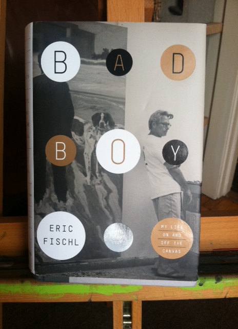
Of the three books I’m describing here, Eric Fischl’s intrigued me the most, so I saved it for last. The title had me hooked: Bad Boy: My Life on and off the Canvas. The back cover features a quote about how Fischl “survived his dreadful childhood, conquered a nearly fatal addiction to booze and cocaine, [and] salvaged his marriage to the marvelous painter April Gornik.” In retrospect, I should have been more wary of a review using the term “marvelous,” which seems more appropriate for a circus or firework show than a landscape painter.
Bad Boy fits into a category of artist bios that aren’t quite literature and aren’t about anyone who leads a terribly interesting life. The sentences roll out in an easy-going, foamy flatness that may be a remnant of Fischl’s time at CalArts. He’s troubled by a childhood with an alcoholic mother, he goes to art school, he teaches, his first marriage isn’t successful but his second is, and when he becomes famous he drinks and snorts cocaine. His hitting-rock-bottom moment is an argument with a stranger on the side of the street next to a police officer. No one gets arrested or throws punches or dies. Fischl just feels like a douche, so he goes sober.
Page 211: “I made a vow that day never to take another drink or do drugs again. And since then I haven’t taken a sip of alcohol or a hit of cocaine. I don’t want to make too much of it. I know what alcoholism, addiction, and abuse are, and I wasn’t there yet.” And that’s the end of his “nearly fatal addiction.”
Don’t get me wrong, I love Fischl’s artwork. If I could choose one piece to hang in my living room by any of the three artists I’m writing about, I’d choose Fischl’s painting Sleepwalker. It depicts a naked teenage boy standing in a backyard kiddie pool at night, and you’re not sure but it looks like the boy is peeing or masturbating. (If you haven’t seen it, please look it up; I’m not reproducing it here because I try to stick to photos I’ve taken myself.) It’s crudely painted and hugely subversive, just my thing. It’s cheeky. I like art that combines humor and poignancy. I’m not nearly as excited about his later India paintings or the group portraits of him and his well-to-do friends yucking it up for the camera on sunny beaches, but he’s still a good painter.
Bad Boy has a few tasty anecdotes, particularly about Fischl’s rivalry with Julian Schnabel, but it seems that he holds back when it comes to the New York party scene. I guess I was hoping for crazy stories à la drunk, naked Jackson Pollock urinating in the fireplace at Peggy Guggenheim’s society party. Fischl describes his art very well though, with explanations of how he developed his painting processes and detailed descriptions of how he started and finished his most famous paintings. Painters will appreciate Bad Boy, as will fans of Fischl’s work.
I’m now enjoying Deborah Solomon’s American Mirror, a biography of Norman Rockwell. Maybe I’ll review it in a later post. In the meantime, let me know of any good art reading you come by. And if you like artist bios, check out my earlier posts touching on books about John James Audubon, Arshile Gorky and Gerhard Richter here, and Martin Kippenberger here.
Filed under: 2013.APRIL | Tags: art, california, contemporary art, etching, how to etch, modern art

My first proof of 61 Pedestrians (Etching).
I love to try new things, and it’s tempting for me to abandon everything I’ve learned each time I begin a project. Experience has shown, however, that starting anew isn’t always the best way forward. My art progresses the most when I select what I like about a piece or a series, keep that constant, and limit my variables.
With that in mind, I decided that my first foray into zinc-plate etching should expand on something I’m already very familiar with — my Pedestrian Series (examples on my website).
As the images in the series are line-based, I chose to work with a hard ground. That means I coated my zinc plate with a thin, brown layer of waxy “ground,” let it dry, and then carved my image into the ground with a stylus called a Whistler’s needle. The lines that I scratched into the wax exposed the shiny zinc plate below. I then set the plate in an acid bath so that the exposed lines were etched into the plate, while the waxy ground protected the rest of the plate.
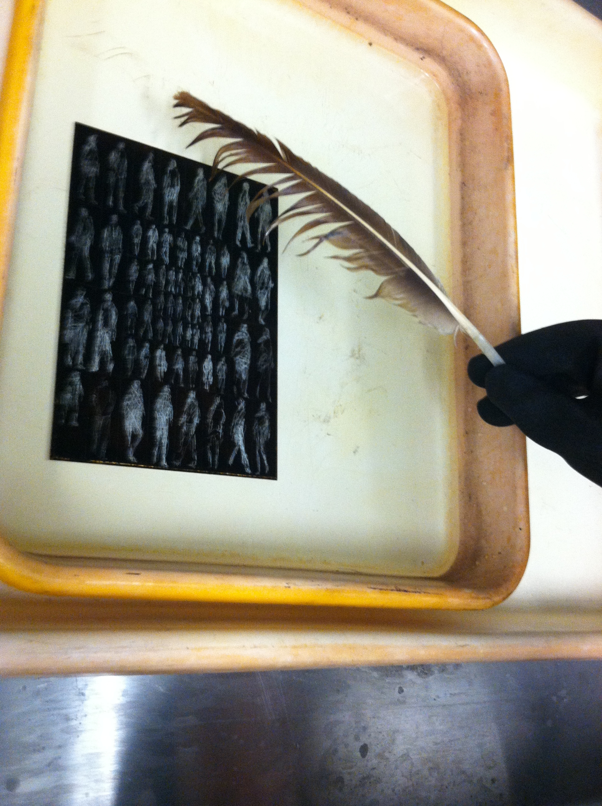
The delicate de-bubbling process.
In the above picture you see my plate in the acid bath. The light figures are the places where I carved away the waxy ground with my Whistler’s needle, and the dark background is the ground. The reaction of the acid and the exposed zinc plate creates small bubbles that need to be brushed off with a feather, or else they’ll leave a small bubble pattern that will distort the lines.
After etching the plate in the acid batch and cleaning off the ground with mineral spirits, I had a clean zinc plate with tiny grooves etched into it. This was covered in ink and then carefully wiped off, leaving ink in the grooves, but not on the surface of the plate. I then set a piece of paper on the plate and ran it through a very tight press, pushing the fibers of the paper into the inked grooves, and wa-lah! — the image you see at the top of this post.

That’s the spirits.
It all sounds simple enough, but it does take time, especially while you’re inking and wiping the plate prior to printing. You can only run the plate through the press once, for a single print, and then you need to ink and wipe again, which takes at least ten minutes. Whenever you finish printing, the plate can be cleaned with mineral spirits and stored until you’re ready to ink-wipe-print again.
I have two more days in the printmaking studio at Golden West College here in Huntington Beach, and I plan to use them experimenting with different inking/wiping techniques. For my first proof I left a lot of “plate tone” to give it a must old-fashioned look, and I want to see what a print will look like if I wipe a little more for a cleaner image.
If any of you have etching experience, let me know if you have any suggestions. If you don’t, I wonder if my description of the process made sense to you — it’s all pretty easy if you’re doing it. Feel like you know how it works?
Filed under: 2013.FEBRUARY, SCRAPS | Tags: art, asian art, California art, Chinese calligraphy, contemporary art, ink painting, Orange County art
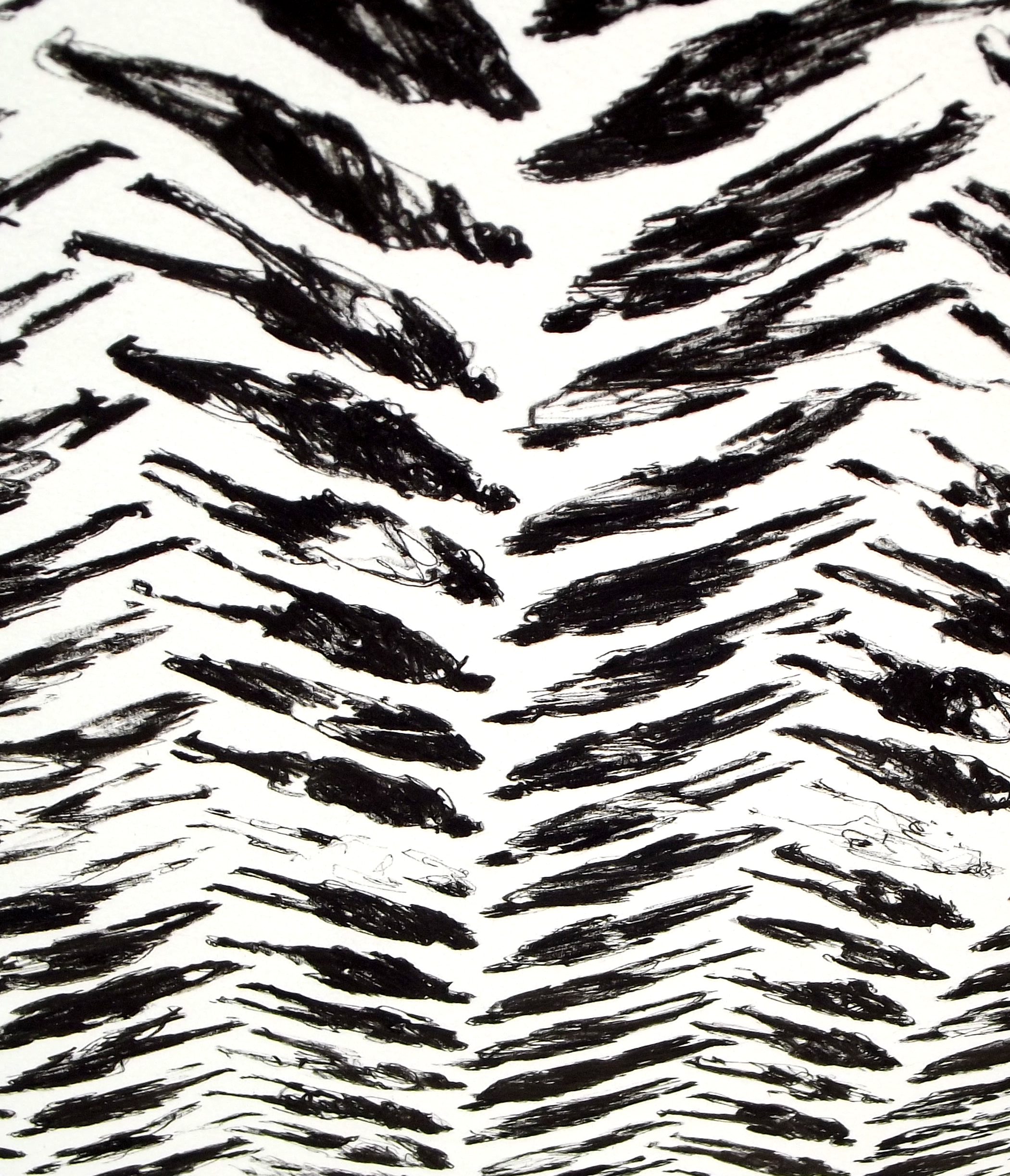
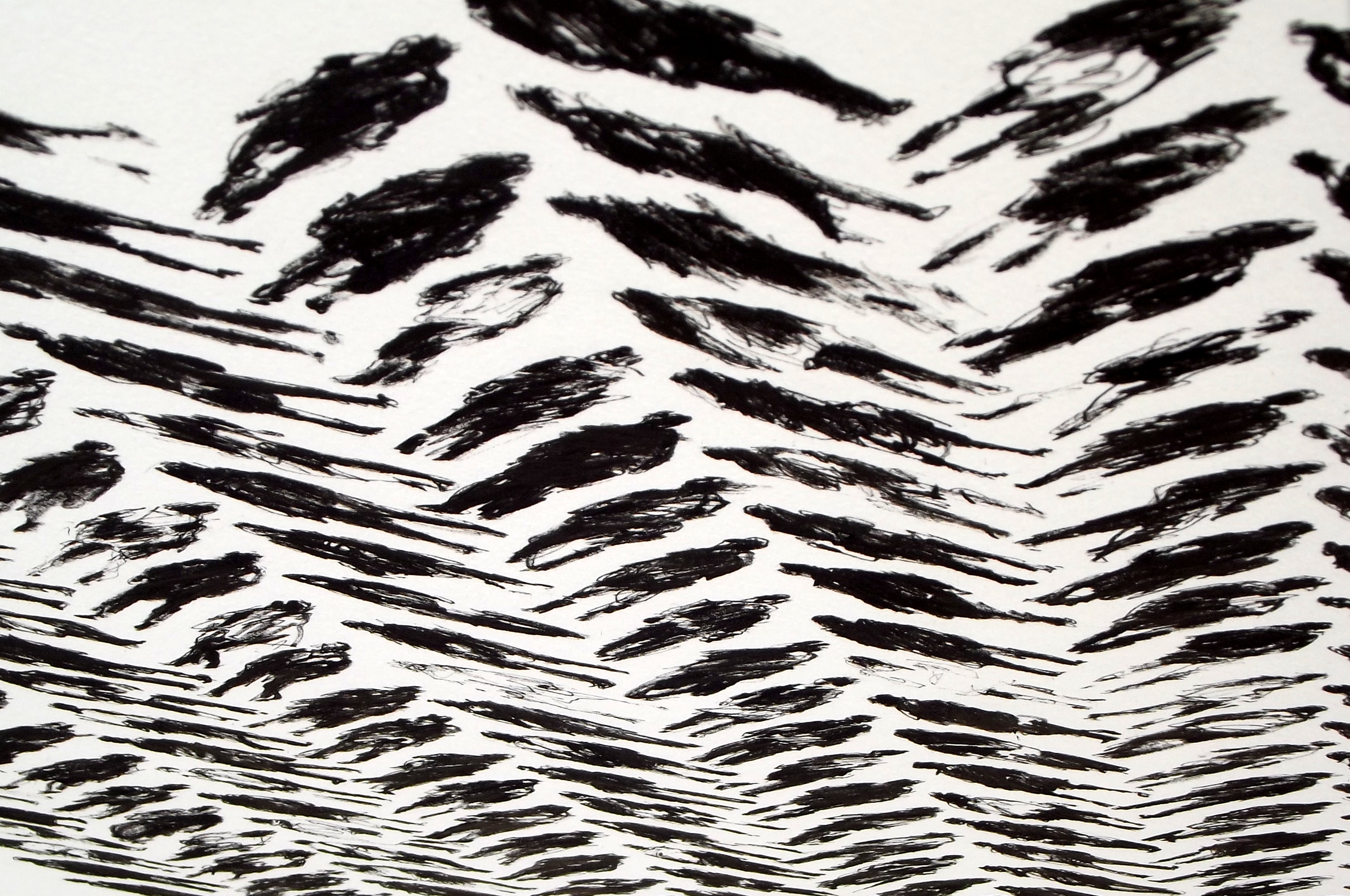
163 Pedestrians (Tread) – DETAIL 1
30×22 inches
Ink on paper
I’ve been working on my Pedestrian Series since I moved from Taiwan to California in late 2011. So far all the pieces are ink on paper. I like scribbling out rough-looking figures and arranging them in neat grids, something like the looser styles of Chinese calligraphy. In my earlier works from the series, I lined the figures up in a very straightforward manner. Every figure in a piece took up the same amount of space, and they were placed in simple columns and rows.
Above and below are details from my latest piece in the series, 163 Pedestrians (Tread). The full piece can be viewed here. Recently I’ve been toying with patterns, and I came up with the layout of Tread while thinking about basic weave patterns. I like the way the picture plane looks three-dimensional from different angles.

163 Pedestrians (Tread) – DETAIL 2
163 Pedestrians (Tread) – DETAIL 3
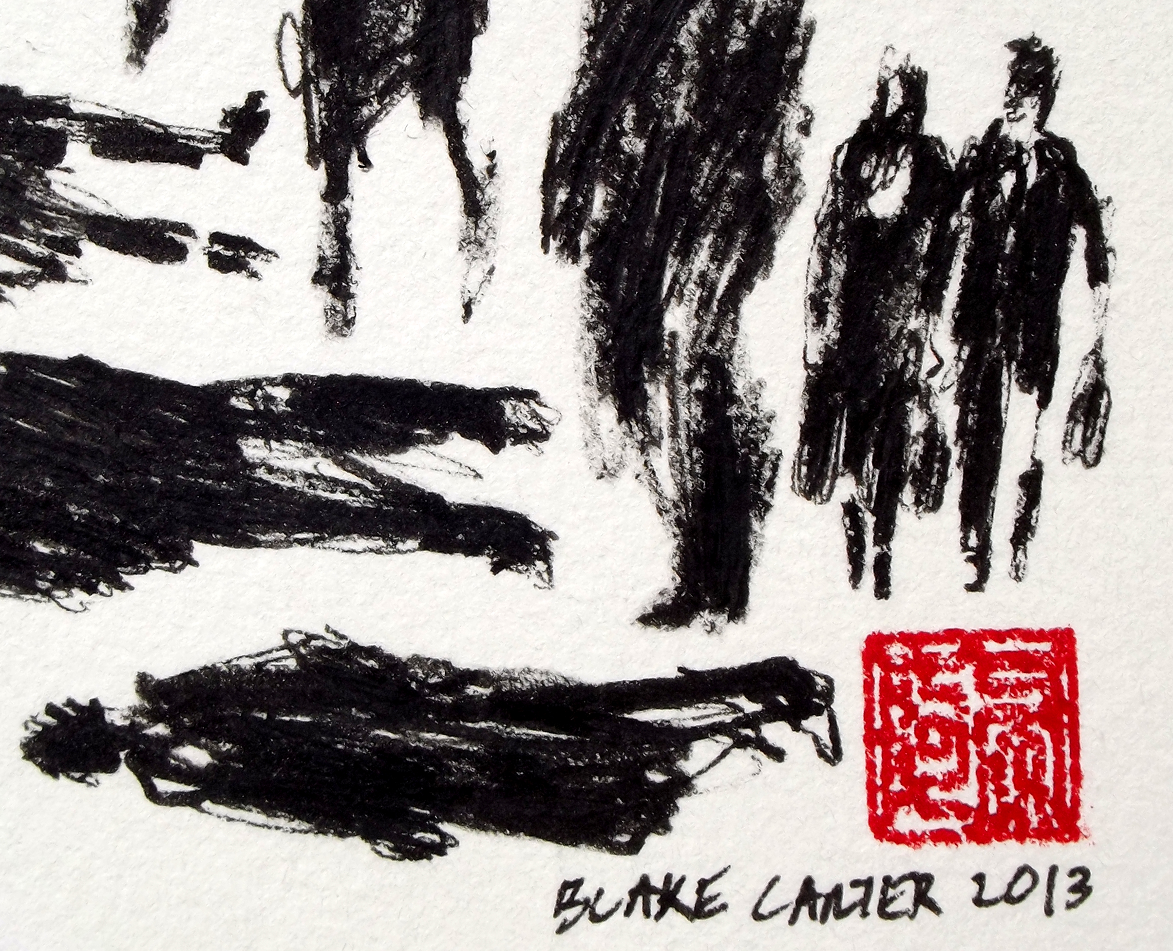
163 Pedestrians (Tread) – DETAIL 4
Once I get a few more images of my newer work ready, I’ll compare the different patterns I’ve been experimenting with.
