
Filed under: 2013.APRIL | Tags: art, california, contemporary art, etching, how to etch, modern art

My first proof of 61 Pedestrians (Etching).
I love to try new things, and it’s tempting for me to abandon everything I’ve learned each time I begin a project. Experience has shown, however, that starting anew isn’t always the best way forward. My art progresses the most when I select what I like about a piece or a series, keep that constant, and limit my variables.
With that in mind, I decided that my first foray into zinc-plate etching should expand on something I’m already very familiar with — my Pedestrian Series (examples on my website).
As the images in the series are line-based, I chose to work with a hard ground. That means I coated my zinc plate with a thin, brown layer of waxy “ground,” let it dry, and then carved my image into the ground with a stylus called a Whistler’s needle. The lines that I scratched into the wax exposed the shiny zinc plate below. I then set the plate in an acid bath so that the exposed lines were etched into the plate, while the waxy ground protected the rest of the plate.
The delicate de-bubbling process.
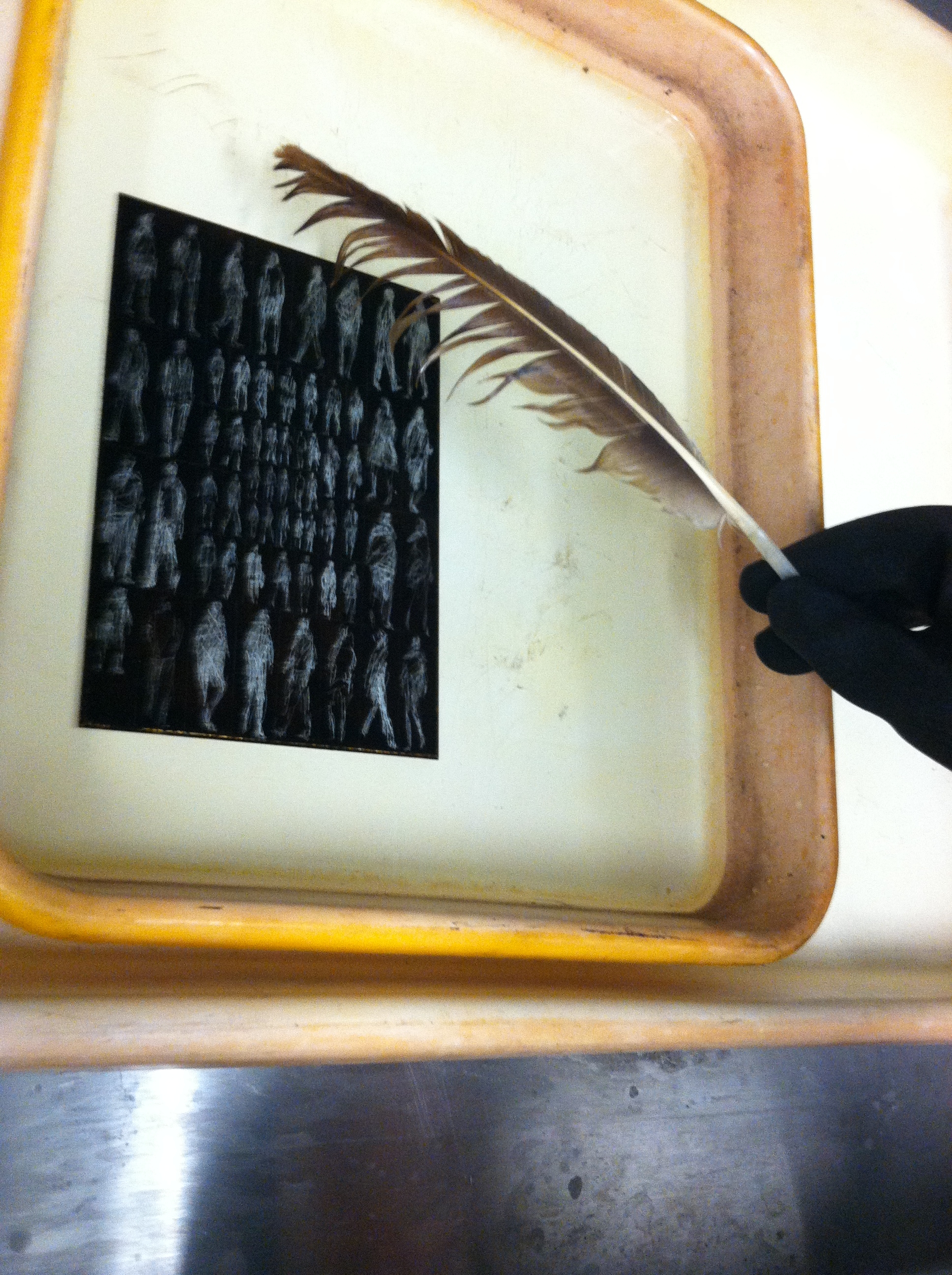
In the above picture you see my plate in the acid bath. The light figures are the places where I carved away the waxy ground with my Whistler’s needle, and the dark background is the ground. The reaction of the acid and the exposed zinc plate creates small bubbles that need to be brushed off with a feather, or else they’ll leave a small bubble pattern that will distort the lines.
After etching the plate in the acid batch and cleaning off the ground with mineral spirits, I had a clean zinc plate with tiny grooves etched into it. This was covered in ink and then carefully wiped off, leaving ink in the grooves, but not on the surface of the plate. I then set a piece of paper on the plate and ran it through a very tight press, pushing the fibers of the paper into the inked grooves, and wa-lah! — the image you see at the top of this post.

That’s the spirits.
It all sounds simple enough, but it does take time, especially while you’re inking and wiping the plate prior to printing. You can only run the plate through the press once, for a single print, and then you need to ink and wipe again, which takes at least ten minutes. Whenever you finish printing, the plate can be cleaned with mineral spirits and stored until you’re ready to ink-wipe-print again.
I have two more days in the printmaking studio at Golden West College here in Huntington Beach, and I plan to use them experimenting with different inking/wiping techniques. For my first proof I left a lot of “plate tone” to give it a must old-fashioned look, and I want to see what a print will look like if I wipe a little more for a cleaner image.
If any of you have etching experience, let me know if you have any suggestions. If you don’t, I wonder if my description of the process made sense to you — it’s all pretty easy if you’re doing it. Feel like you know how it works?
Filed under: SCRAPS, Uncategorized | Tags: art technique, chuck close, contemporary art, de kooning, fragonard, franz kline, goya, jim morrison, leibovitz, modern art, rembrandt, sakura
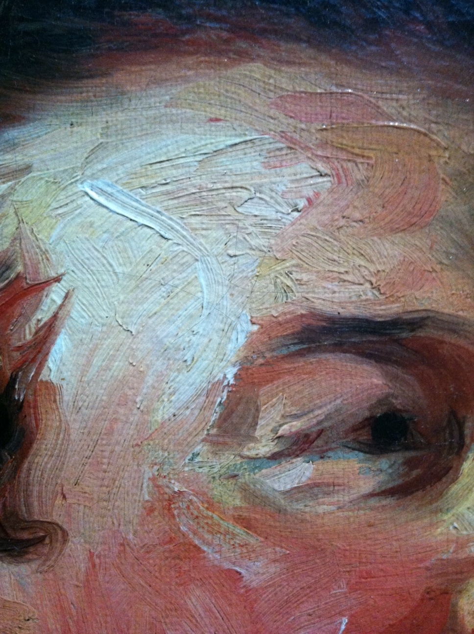
Jean-Honore Fragonard, Francois-Henri, Duke of Harcourt (Detail 1), ~1769
I’ve been thinking of this painting by Jean-Honore Fragonard since I saw it a couple weeks ago at the Getty in Los Angeles (detail above). It’s certainly not the kind of thing I’d expect from the painter of The Swing and other cloying confections. The impasto brushwork looks more like something you’d expect from Goya or Rembrandt. And wouldn’t you know it, Frago admired and sometimes copied Rembrandt’s paintings, according to John Canaday in The Lives of the Painters. (By the way, the excellent-condition, four-volume, used hardcover Lives is by far the best US$4 I ever spent on Amazon. Think I may have overpaid — there’s a set on Amazon now for $3.64.)

Detail 2
Stepping back a bit the head emerges. I wonder if a less confident artist would have tried to blend in the four grey marks on the duke’s jowls.
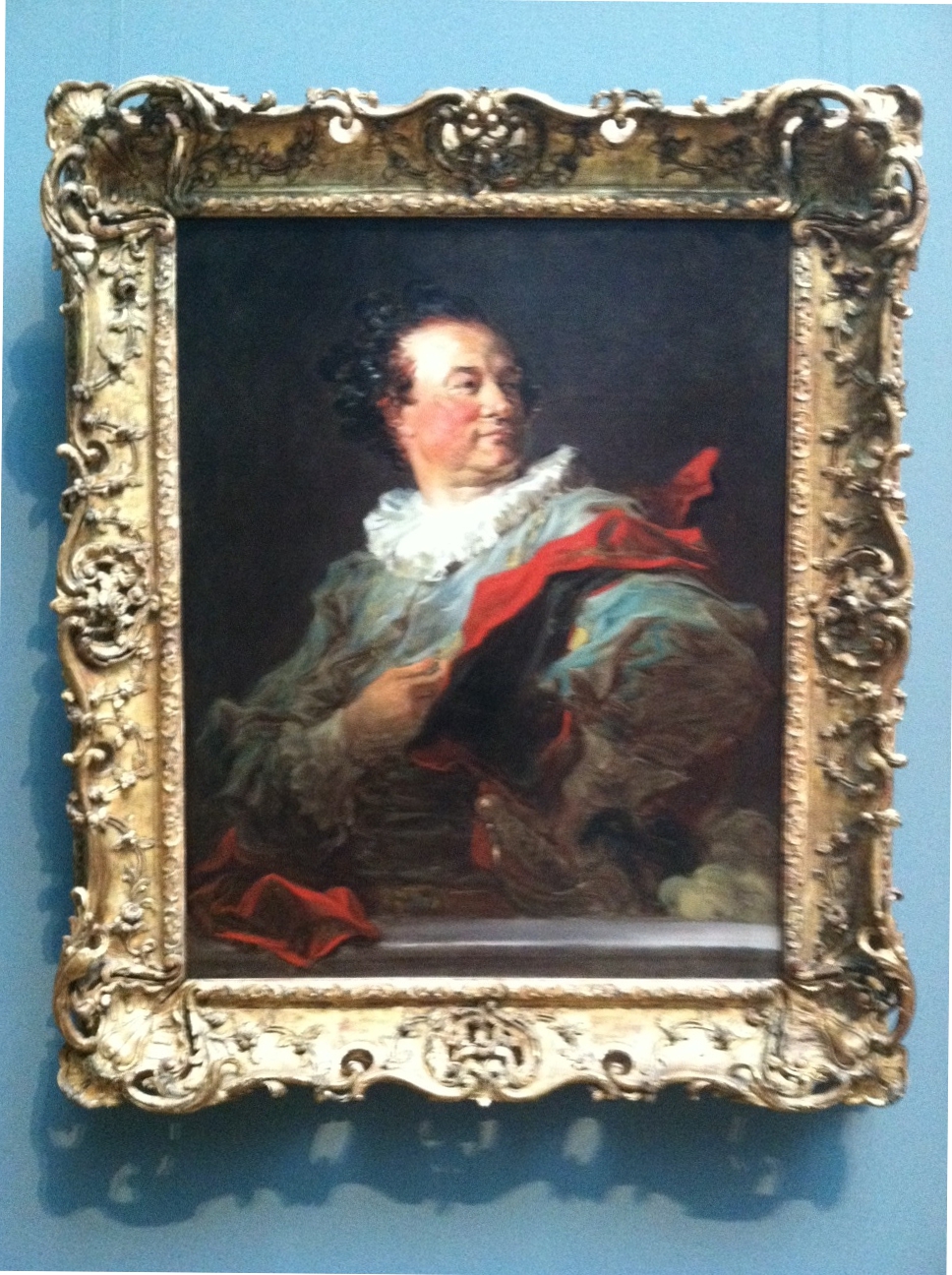
Fragonard, Francois-Henri, Duke of Harcourt
Here’s the full picture, above. Don’t know if I would have been terribly interested to take a closer look if I’d just seen this image in a book. There’s an affected gallantry that I imagine the subject loved, but it strikes me as a little over the top. Glad I did though. The placard next to this painting notes that Frago spent “as little as an hour to complete each of the canvases” of the series that includes this work, which helps explain the “bravura brushwork of rapid, fluid strokes.”
I’m particularly interested in this Fragonard painting right now because I’ve been working on a similar effect in my Pedestrian Series. I discussed the difficulty of photographing my work and the importance of viewing my work in person in an earlier post. Below is a detail from my last work of 2012:

Blake Carter, 335 Pedestrians (Skull) (Detail 1), 2012
Recently I decided to try something that I’ve been knocking around for a while. I’ve been drawing figures with Sakura Pigma pens and Faber-Castell PITT Artist pens for a few years and feel I have a bit of control with them, despite the fact my process is reliant on a lot of “happy accidents” that occur while I’m scribbling. In the detail above you can see the variety of marks I use.

Detail 2
From the little distance of the image above (detail appr 2×3 inches), it’s obvious the marks in my piece describe individual figures. There are parts with heavier marks, and parts with lighter marks.

Detail 3
Now you see what I’m getting at. By altering the weight of the marks in each figure, I can use the smaller figures to create a larger image.

Carter, 335 Pedestrians (Skull)
There’s the full piece, above. Nothing revolutionary. When I was in high school, the art teacher gridded out a Leibovitz picture of Jim Morrison and had her students each draw a small piece (maybe a foot square), then arranged them all and hung them in the lunchroom. Chuck Close also comes to mind, as well as every super-realist who talks about concentrating on the individual grids in an image and treating them as small, abstract paintings that add up to completed pieces resembling photographs.
It’s a simple idea, but it’s very important when looking at art, and paintings in particular. Any figurative or landscape piece can be broken up into an infinite number of smaller, abstract images. I’m currently reading a book about Alice Neel (Alice Neel: The Art of Not Sitting Pretty by Phoebe Hoban), who worked in New York in the middle of the last century, a time when critics and artists vigorously proclaimed allegiance to abstract versus figurative art.
They all seem a bit silly now. If I fail to see the figure of a woman in a painting from de Kooning’s Woman Series, is it abstract? What if I think Franz Kline’s work looks derivative of Chinese characters — does that make it more based in visual reality?
Filed under: 2012.NOVEMBER, SCRAPS | Tags: art, art technique, calligraphy, China, chinese art, Chinese calligraphy, contemporary art, drawing, ink, modern art, scroll painting
")
In my previous post I noted how differently pieces from my Pedestrian Series look in real life and in photographs. Here are more close-ups, this time from 255 Pedestrians, a piece I finished yesterday. Watch the figure above as you scroll down. Starting with her, I zoom out to show the surrounding eight figures, then the sixteen figures surrounding those, and etc, up to the finished work.
")
")
")
")

